
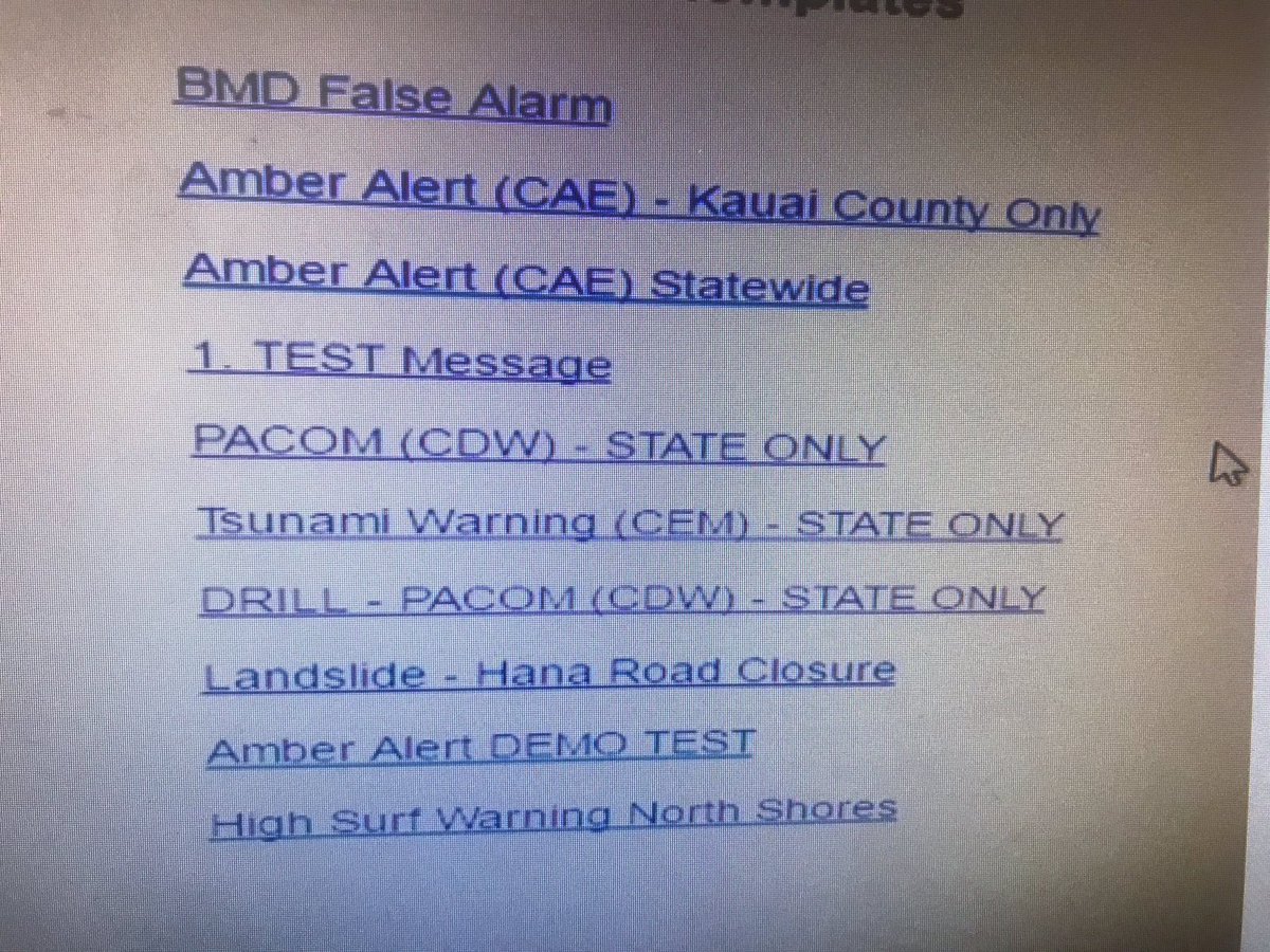
On the 13th January 2018, at 8.05am, an employee at Hawaii Emergency Management Agency saw ten options on a menu, two of which (not directly next to each other) were for warning the public about incoming missile threats. One was for a drill, while the other specifically stated it was not a drill. At 8.10am there was widespread panic throughout the state.
The two buttons were labelled ‘PACOM (CDW) – STATE ONLY’ and ‘DRILL – PACOM (CDW) – STATE ONLY’. Same font, same colour, and mixed with several other unrelated options. The employee accidentally pressed the option labelled ‘PACOM (CDW) – STATE ONLY’, sending out a text to the population stating “BALLISTIC MISSILE THREAT INBOUND TO HAWAII. SEEK IMMEDIATE SHELTER. THIS IS NOT A DRILL.” It’s a blunder that will be used as an excellent example of a poor User Interface (UI) for years to come.
It was far from the worst example of a user interface causing disaster, however. In 1988, the USS Vincennes shot down a civilian aeroplane because the interface that tracked targets on the radar and displayed information required two separate cursors; one for tracking the target and another for extracting information. When the ship was tracking the civilian plane with one cursor, the cursor that displays information was on an enemy target, so the plane appeared as an enemy, with tragic results.
Luckily, disasters with such terrible consequences are rare, but bad UI design is still very common. In business, a good UI can mean the difference between securing new leads and losing customers because no one wants to feel lost or confused when navigating a website or application. Yet some web designers still make basic mistakes. To do our part, we present solutions to some of the most common UI problems so they will never happen again, all thanks to us.
Be responsive
With so much of online traffic coming from mobile devices, it’s little wonder that responsive websites have become the rule, rather than the exception. For modern businesses, there is simply no excuse for a website not being formatted for use on a mobile or tablet. Responsive sites format themselves for the relevant screen size, while non-responsive sites on mobile devices are difficult to scroll, the fonts are either too big or too small, and navigation difficult. If a business doesn’t take the time to ensure their site is responsive they are essentially dismissing a large portion of their internet-using audience.
Don’t over-complicate the interface
A good UI means ensuring users can operate all the features easily with as little confusion as possible. This means that things should remain easy to use. That’s not the same as being simple (OK maybe it is, technically, but bear with me). In my mind, a simple web design has very few features and options to navigate between, while an easy UI is instantly accessible no matter how many features and navigation options there are. Too much can be difficult for a user to get their head around, and this doesn’t just refer to what’s on screen, but how they interact with it.
Windows 8 is a great example of web designers not taking heed of the lessons we were supposed to learn from Jurassic Park: just because we can do something, it doesn’t mean we should. With the evolution of touchscreen technology, the tech giant decided to incorporate it into their OS interface, while also keeping the traditional keyboard/mouse system. The result, however, was an incredibly confusing combination of the two, with separate web browsers, Control Panels, and more. Users were required to learn two different ways of interacting with the OS, and it was not received well. Innovation for innovation’s sake is not progress, it’s just convenient marketing material that doesn’t help the end user.
Get your forms right
For many B2B businesses, the first step in gaining new leads via their website is persuading them to get in touch and send their details. Whether it’s a business enquiry or signing up for a newsletter, it’s the start of a potentially lucrative relationship. That’s why if your site uses a contact form, it HAS to be up to scratch.
Here are some examples of what not to do in contact forms:
- Putting the question inside the answer field
This might occasionally be aesthetically pleasing and minimalistic, but it’s also very frustrating. Beginning to type an answer only for the question to disappear might seem logical (after all, you don’t start typing until you’ve read the question, right?) but it’s not. How many times have you double-checked that what you’re typing is relevant to the question? Clarity and convenience are essential in your UI, and forcing someone to remove everything they’ve typed in a field so far just so they can check the question is both inconvenient and confusing. - Adding a reset button
This mistake is relatively self-explanatory and it is mystifying why any designer would think it was a good idea. Worse still, it’s often placed next to the Submit button. While I don’t have the statistics to prove it, I’m willing to bet that Reset buttons have been pressed more times accidentally than intentionally, because there’s very little practical use in hitting Reset when simply selecting all the text and typing over it works just fine. - The guiding text in the answer field doesn’t automatically disappear
In many answer fields, you’ll see semi-transparent text that explains what should be in that field, such as name, address line 1, company etc. These are helpful and convenient! But it’s expected – especially if the font is semi-transparent – for the font to disappear as soon as the answer field is selected. There are many application forms mistakenly sent that have the name field as ‘NameDavid Bachman’. This isn’t a deal breaker but can sour the user’s experience when they have to click back to fix the problem. After all, the fewer clicks to get to their objective, the better.
While we’re on the subject of text fields, add a ‘show password’ option to your apps and websites! Not knowing if you’ve mistyped your password is frustrating, especially if you’re not sure if you’re typing the right one, or the password is particularly complicated. In most circumstances, there won’t be someone looking over the user’s shoulder, so allow them to see what they’re typing if they’d like to.
Be Clear and Consistent
If a designer has managed to make a page with an exceptional user interface, then be consistent with it! Don’t change the interactive rulebook on each page. Certain navigational tools need to be accessible all the time to make sure the user will never feel lost. But it’s not just buttons and CTAs that need to stay familiar – colour schemes and layouts need to be consistent as well, with a familiar hierarchy of information. Users should be able to scan each page with ease thanks to a ‘learnable’ website layout.
Perhaps the most common UI problem we come across is one of contrast. A website becomes unusable if the text, buttons, and menus blend into the background. Also consider that it’s not just colour and shading that can affect contrast, but also patterns. Whatever the background is, it needs to be an effective contrast to all the content displayed on it so users can quickly and clearly find their way to their objective.
Those were the most common user interface mistakes we have come across; are there any we missed that you think belong on the list? Let us know on our Twitter and Facebook pages.