Home
  • Contact
  • Work
  • Insights
  • About
  • Contact
  • LinkedIn
  • Instagram
  • YouTube
  • Creative Pool

© 02.03.04 – Dusted Design Partners (trading as “Dusted” in the UK) is part of Dusted Group Limited. The Dusted name, Dusted logo and “D.” device are registered trademarks (in the UK) of Dusted Design Partners.

  • Privacy policy
  • Cookies policy
Accreditation
Home

Beacon

A brand to create hope and light where there’s only darkness.

Ambition to action.

services

BrandDigital

sectors

BiotechMedtech

Beacon is a groundbreaking retinal gene therapy company focused on restoring and preserving sight. One of the rare conditions they address takes the sight of young men in a short timespan. Currently there is no cure available. The doctors refer to it as ‘waiting for darkness’.

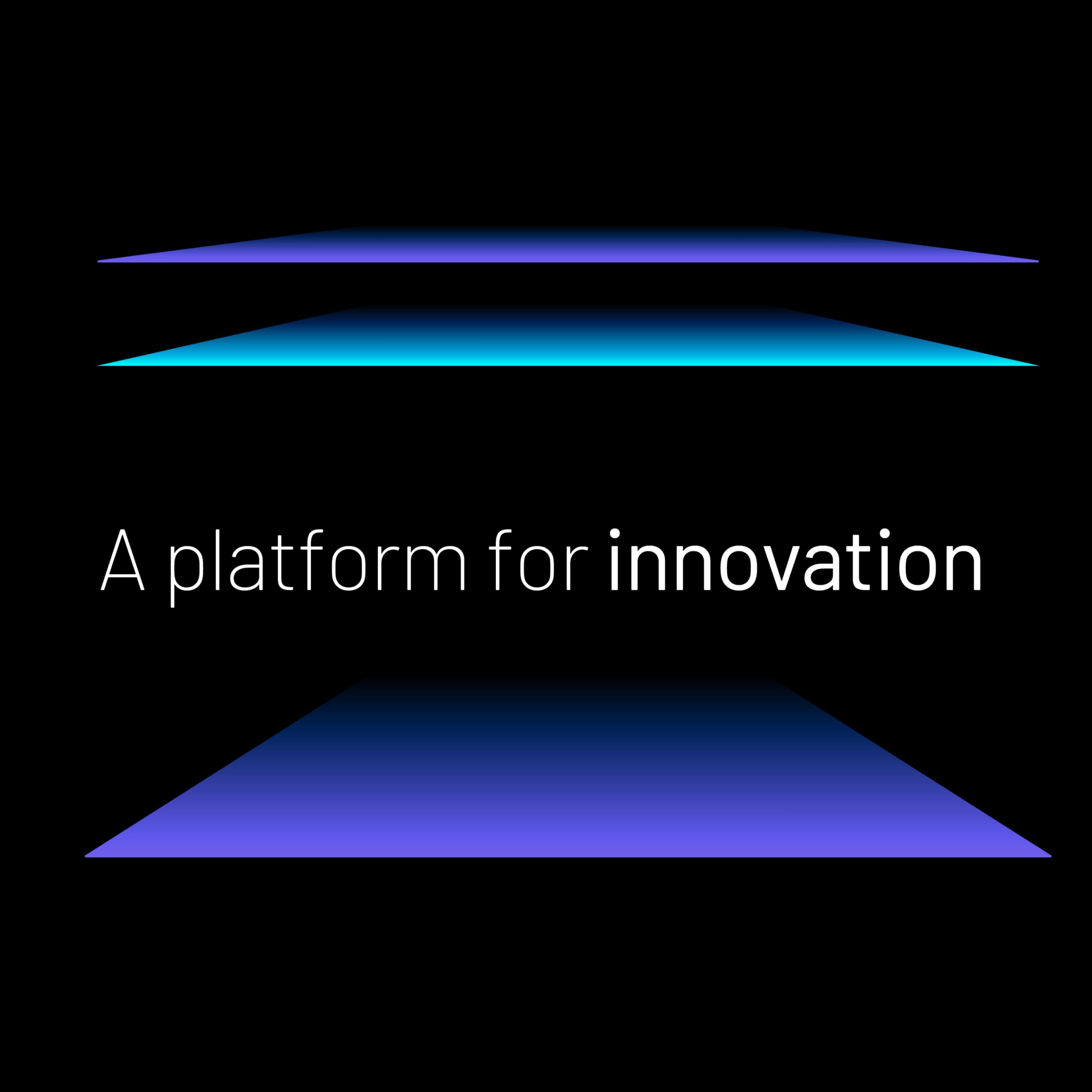
How do you create a brand that signals the hope of a bright new future where there has only ever been complete darkness? It all started with the name. Our client had a real desire to create a brand built around the patient and their emotional needs. They wanted the brand to be as human as possible, to embody hope and to emotionalise their pioneering science. This required a conscious shift away from the visual pre-conceptions seen often within the science sector.

The project included: Brand strategy, brand proposition, naming, visual identity, full channel brand activation, motion design, website UX/UI & build, brand guidelines.

We generated 250+ names in the long list across 3 territories to create the name Beacon:

  1. Innovation, Science & Mythology
  2. Nature and vision
  3. Trust and integrity

Beacon is a simple message based on the signal for improvement. The beacon of light that forms that signal. The name and brand strategy informed the complete direction of the visual langauge.

Understanding the diverse needs of Beacon’s audiences, we strategically developed a brand-new website that seamlessly merged functionality
with accessibility.

Our solution involved a simplified approach to navigation to ensure a user-friendly experience, aligning with the inclusive platform Beacon aimed to establish. We implemented high-contrast colour schemes and customisable font sizes to cater to varying visual needs.

Beacon’s brand has proved hugely successful in defining our new identity and acting as an anchor point for the integration of legacy companies internally. The clarity of our brand has also been well received externally, with a simple message and clear lineage to our ophthalmology mission.

Ben Rigby
VP Business Operations, Beacon
View Website

Related projects

mymediset

Redefining intelligence in medtech logistics.

Text graphic promoting a platform for innovation with layered colors.
Geometric shapes in neon green on a dark background.
3-in-1 wireless charging stand for Apple Watch and iPhone.
Black electric SUV with illuminated features against a gradient background.
Stylized letters 'AI' against a blue background with waves.
Smiling man in a blazer with glasses against a colorful background.
Abstract design with red lines on a black background and text.
Close-up of vibrant blue flowers with yellow stamens.
Abstract logo featuring white and red geometric shapes.
Person holding a white tote bag with a red Verbatim logo.

[Contact us]

Let’s build your brand edge.

Schedule a discovery call with our award-winning team to see how we can transform your brand vision into reality.

Get in touch