Home
  • Contact
  • Work
  • Insights
  • About
  • Contact

London.

65 Leadenhall Street
London EC3A 2AD
View map
  • LinkedIn
  • Instagram
  • YouTube
  • Creative Pool

© 02.03.04 – Dusted Design Partners (trading as “Dusted” in the UK) is part of Dusted Group Limited. The Dusted name, Dusted logo and “D.” device are registered trademarks (in the UK) of Dusted Design Partners.

  • Privacy policy
  • Cookies policy
Accreditation
Home

[Brand]

Brand identity.

Audience, trends, competitors and culture. We conduct brand research that turns insights into brand strategy. And brand strategy into value.
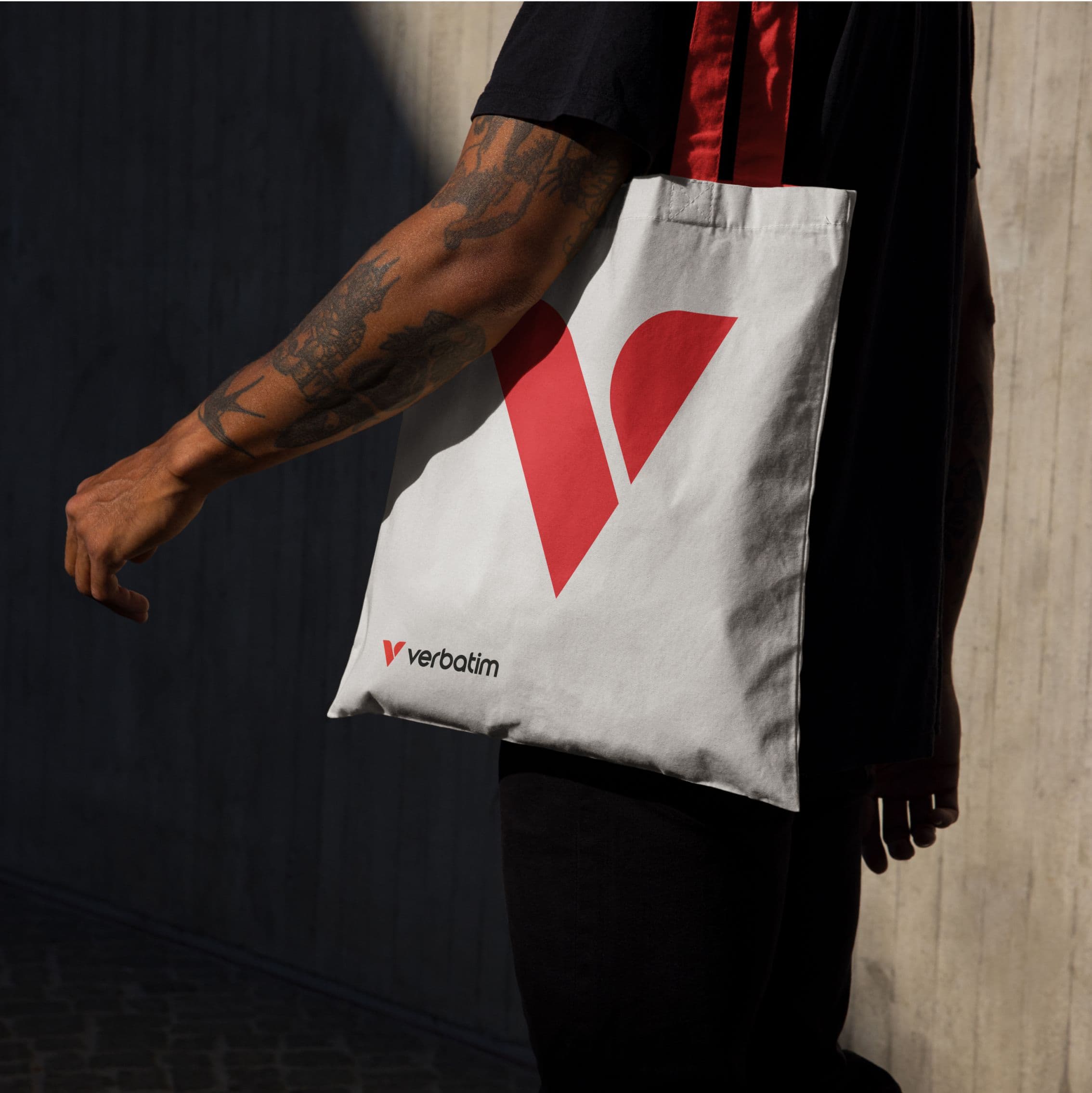
Logo design.

A brand logo is a signal. A shortcut to your promise. But in a world of scrolls, swipes and micro-moments, it has to work harder. And smarter.

We design logos that flex. Built to adapt across formats, channels and contexts. Symbols and wordmarks that move together or stand alone. Components that scale, from social icons to storefronts. We design logos with motion in mind, part of a wider visual identity system and rooted in your brand strategy. Living assets, ready to evolve and reinforce brand awareness at every touchpoint.

Visual & verbal.

This is where strategy finds its voice. And its look. Visual identity and verbal Identity are the tools that bring brands to life, translating insight into expression.

We start with the core: your brand strategy, audience and personality. Then we build a tonal system that reflects it all. From colour palette to tone, from visual elements to sonic cues, we create identity systems that connect on every level. Designed to shift brand perception and deepen customer loyalty.

Motion & animation.

Motion is where your brand comes alive. It’s expressive, immersive, and captivating. It adds energy and cut-through.

We build it in from the start as a way to shape meaning, signal intent and hold attention across every screen. From fluid transitions to smart micro-interactions, motion makes your brand feel alive. And in a world that doesn’t sit still, it helps you move at the right pace.

Typography.

Typography is one of the sharpest tools in the brand kit. In a world of lookalike interfaces, rigid formats and accessibility demands, it’s a key space to stand out.

We treat type as a strategic asset, selecting, customising or creating systems that reinforce brand voice and clarity, enhancing consumer perception and brand awareness. From pragmatic to expressive, every choice is purposeful. When done right, it builds recognition, reinforces identity and gives your brand the edge where others blend in.

Iconography.

We design iconography that works hard in every context. In UX, clarity comes first, helping users act fast and instinctively. But there’s room to go further. Icons can carry brand cues, signal personality and add detail without noise.

They’re shorthand in a fast-moving world. Scalable, intuitive, and, when motion’s involved, even more engaging. Done right, they bring warmth, rhythm and recognition to your visual identity. Small touches, big impact.

Imagery.

Imagery is a key driver of distinction. It shapes first impressions, builds credibility and gives your brand a visual tone.

We define original styles that stand out, avoiding generic stock in favour of brand images with intent. From photography to illustration, abstract graphics to CGI, we create imagery that aligns with strategy and elevates storytelling.

Art direction.

Art direction shapes how visuals come to life through structure, composition, styling and mood. Whether we’re working with photographers, illustrators or CGI artists, every visual decision is guided with intent. Angles. Lighting. Texture. Finish. Nothing is accidental.

It’s also about curation. Choosing what aligns to your brand identity and what doesn’t. We create consistency across every asset and every platform, to enhance brand awareness and sharpen brand perception.

Sonic & audio.

Sound builds emotional connection. From product cues to branded scores, sonic branding adds a new layer to your sensory Identity.

Once reserved for media-first brands, it’s now a key layer in any modern identity system. When aligned with your verbal Identity, tone of voice and visual identity, it adds dimension, recall and edge. A Think sonic logos, motion sounds, even UI tones.

Identity toolkit.

The identity toolkit brings it all together. Logos, type, icons, imagery, templates, tone. The full set of ingredients that shapes your brand identity. How it looks, sounds and behaves.

It’s built for real-world use, giving teams the power to apply your brand with clarity and consistency. Wrapped into clear, actionable guidelines, it’s everything you need to show up aligned.

Brand guidelines.

If the toolkit is the “what”, the guidelines are the “how”. Together, they keep your brand firing on all fronts. We deliver them as either a PDF or as dynamic, online systems that bring your brand to life. Hosted platforms house the full identity toolkit, from logos and templates to image libraries and tone of voice. Integrated with DAM systems and approval workflows, they keep everything aligned, on-brand and easy to use.

Brand guardians.

We build brands. And we also protect them. As brand guardians, we work closely with CMOs, heads of marketing and in-house teams to keep everything on point. From campaign reviews to comms audits, we offer clear, confident direction. Flagging what’s working, fixing what’s not, and keeping your brand sharp across every touchpoint.

We also provide hands-on creative support, acting as an extension of your design team to review, refine and steer execution. It’s long-term brand care, built on deep partnership, rooted in insight and informed by market analysis and consumer research. Because consistency builds trust. And trust builds value.

Related insights.

Building institutional trust. Why generic branding weakens financial services brands.

There’s no shortage of noise in fintech branding. Big claims. Disruption narratives. Technology framed as the answer to everything. In financial services, that approach erodes confidence. Between 2020 and 2026, the fintech market split. Capital began flowing toward businesses with clear…

Transforming brands in hard-to-move categories. Lessons from our award-winning work.

With the 2026 Transform Awards Europe approaching, I sat down once again with Dusted’s Creative Director, Paul Marten, to reflect on a different question from our last conversation. Not simply what makes brand work award-worthy, but what happens when that work takes place in categories that rarely…

What it takes to create award-winning brands. Reflecting on our past wins with Creative Director Paul Marten.

The Transform Awards recognise the most effective brand transformations. And over the past six years, Dusted’s work with ambitious clients has earned us more than 20 awards across sectors ranging from technology and life sciences to consumer electronics. With the 2026 Transform Awards Europe…

Towards a new brand architecture. Less brands. More value.

Lately at Dusted, we’ve seen the same challenge cropping up in brand strategy projects — portfolios tangled in layers of product and service names that add more noise than meaning. So, I wanted to share a brief look at how we approach fixing that. Because, to me, the smartest brand architecture…
Text graphic promoting a platform for innovation with layered colors.
Geometric shapes in neon green on a dark background.
3-in-1 wireless charging stand for Apple Watch and iPhone.
Black electric SUV with illuminated features against a gradient background.
Stylized letters 'AI' against a blue background with waves.
Smiling man in a blazer with glasses against a colorful background.
Abstract design with red lines on a black background and text.
Close-up of vibrant blue flowers with yellow stamens.
Abstract logo featuring white and red geometric shapes.
Person holding a white tote bag with a red Verbatim logo.

[Contact us]

Let’s build your brand edge.

Schedule a discovery call with our award-winning team to see how we can transform your brand vision into reality.

Get in touch