
You don’t need to be particularly observant to have noticed that the World Cup 2018 has started. So far there’s already been football drama, fouls, goals… err, offsides? OK, busted, I don’t know a lot about football, but a lot of the folk in the office do.
However, it’s not football know-how we’re discussing today, it’s football design. Since it’s the World Cup, we thought we’d get our design experts to assess the team kits and give us their opinion on the best and worst designs.
John
John, our Senior Designer and only member of our Steep Hall of Infamy, was the first to voice his opinion.
Best: Nigeria
“I don’t know how much sugar Nike had eaten when they did Nigeria’s kit, but I like it because it does what us designers like – it stands out from the crowd and shows creative thinking. Plus, it’s a wild acid green colour, so hats off to Nigeria for designing a kit seemingly inspired by a tennis ball.”
Worst: South Korea
“Designers like minimal. We’re constantly trying to de-clutter and embody the ‘less is more’ ethic. So I should really like South Korea’s home kit; it is the definition of minimalist. The problem is that that’s pretty much all it is. A red shirt with a white number on it. That’s not very creative.”
Ollie
Ollie doesn’t especially follow football but is nonetheless fascinated by the pretty colours and flickering images on the TV. Among these flickering images were some football kits, so he told us his thoughts about them.
Best: Japan
“I find myself drawn to Japan’s kit. Its designers seem to have managed to embody the perceived virtues of the nation into an item of clothing; precision, discipline, and understatement. Of course, these are all attractive words when talking about design as a whole, so it’s little wonder I’m drawn to Japan’s kit, given my chosen vocation.”
Worst: Germany
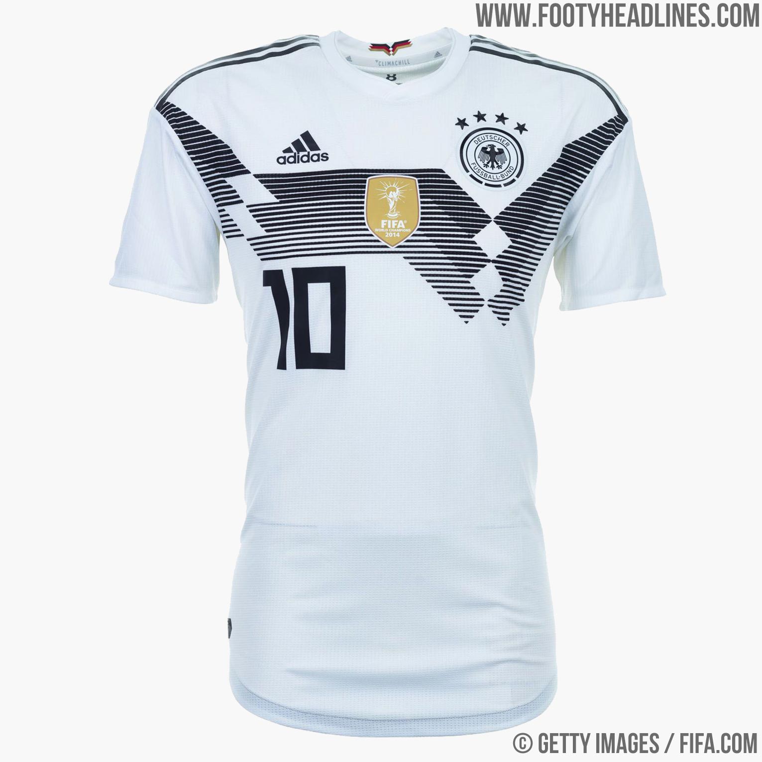
“Not sure what’s happened here as their kit is normally quite nice. To me, it looks like the designers have too self-consciously tried to make the kit look ‘designed’ – its asymmetrical design breaks up the badge, manufacturer’s logo, and player number so there’s no sense of harmony; it’s like there’s a wall being driven between the elements. To be honest, I think it looks like a horrible 1980s tracksuit.”
Rose
Rose’s opinions are based on her years of experience as a professional designer, her aptitude for fashion and style, and a little sprinkle of how hot the players are.
Best: France
“I have family connections in France, so I admit to being biased here. That said, this jersey stood out at me for all the right reasons. Simple, elegant, and understated, it screams ‘French’. The detail is all there, from the personalised typeface to the nice addition of the hexagon design weaved into the interior as a nod to the geometric shape of France. This minimalism and subtlety is a ballsy move (geddit) so much so I had to do a double take to even check it was France. Bravo indeed.”
Worst: Spain
“As one of the most recognisable kits of any tournament, I wanted to like this one. The Spanish kit doesn’t need to shout; the colour and regality of it do that automatically. Yet this new design feels like a tweak that, perhaps, didn’t need to happen. It’s distracting and looks disconnected from the rest of the jersey. Fortunately for them, with the likes of Gerard Piqué, (hey Piqué, how you doin’?) the jersey is probably the last thing people will notice.”
Dave
Dave and John disagree over their final decisions. Dave claims that John’s opinion – along with the opinion of the rest of the world (based on worldwide kit sales data) – is wrong. John is definitely on the back foot on this one.
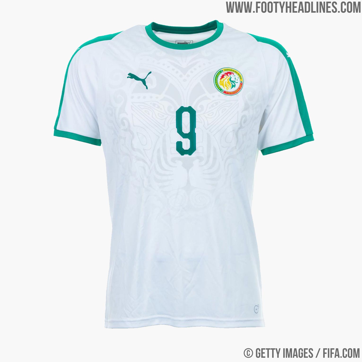
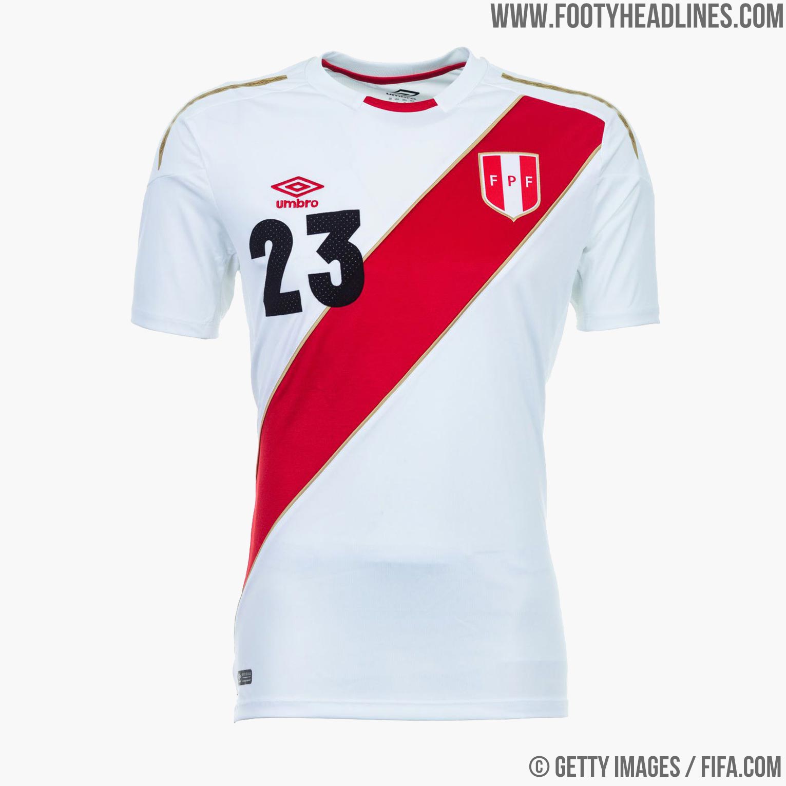
Best: Senegal
“My personal favourite is that of Peru because who doesn’t love a beauty pageant sash? Moreover, its the only shirt Umbro sponsor, which feels proper underdog alongside the might of Nike. However, the best has to be Senegal. Too subtle to see on even the best 4K TV, but the ‘hidden’ lion head (their mascot) is inspired. Appropriately, Puma is their sponsor, too.”
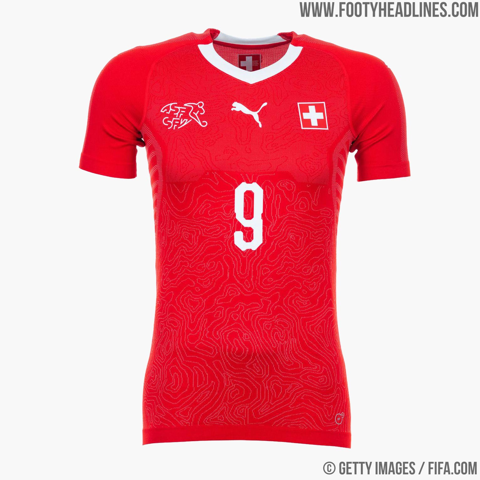
Worst: Nigeria
“Officially, the ‘best’ strip is Nigeria’s, which sold out worldwide in 15 minutes, apparently, and had people queuing round the block to get theirs at Nike Town last week. Overhyped, I say and, in contrast, Switzerland has been referred to as the “Helvetica of kits”, spoilt only by Puma’s typeface used for the shirt numbers. Adidas, on the other hand, have avoided this problem with only a ruler.”
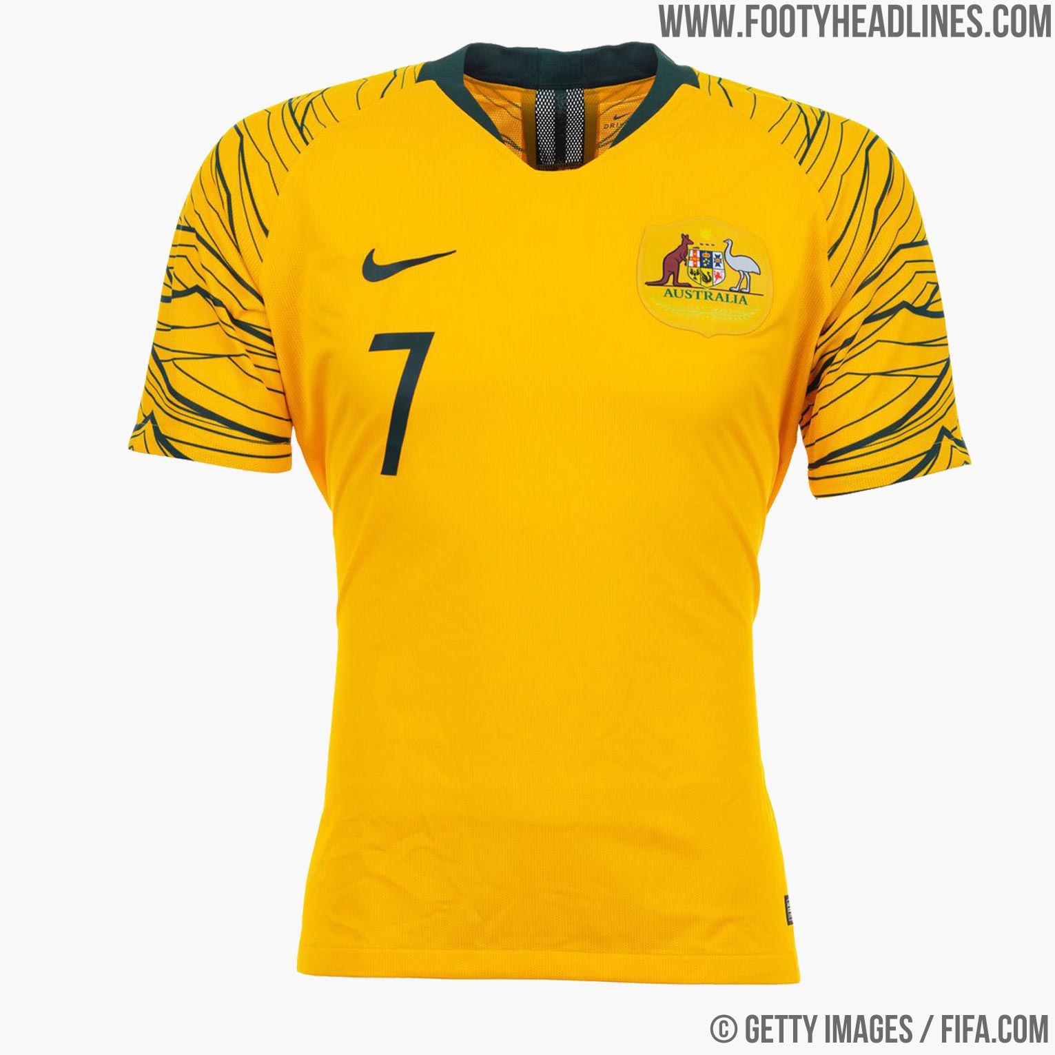
There are a lot of different ideas here, but if there’s one thing that our designers agree on, it’s that this wasn’t a very simple task. The jerseys in this tournament are, for the most part, very well designed. The chances are, you have your own idea about which kit is best, and I’m sure your decision can be equally justified. That is unless your favourite is Australia because, blimey-o’riley, what a mess….