From towers to skyscrapers, stadiums to shopping centres, WIG powers the signal behind everyday life. Wherever people connect.

From towers to skyscrapers, stadiums to shopping centres, WIG powers the signal behind everyday life. Wherever people connect.
Wireless Infrastructure Group (WIG) is the UK’s independent leader in wireless infrastructure. With over 3,300 facilities across the UK, US and Europe, their networks keep people connected outdoors through towers and indoors through high-demand venues, from skyscrapers and stadiums to shopping centres and transit hubs.
The towers business was already thriving. But the biggest growth opportunity lay indoors. High-traffic environments demand seamless mobile connectivity, and while WIG had the technical capability, their brand wasn’t telling the story. Competitors were outpacing them with sharper positioning, clearer narratives and more emotive engagement. WIG’s brand felt corporate and cold. Reliable, yes, but losing ground in a market driven by agility, innovation and human benefit.
That’s where we came in. Dusted worked with WIG to define a modern proposition, sharpen their positioning and reimagine their creative direction. From stakeholder workshops to competitor analysis, messaging to design concepts, we built a brand presence that matched their market leadership. Confident, contemporary and ready to win the indoor networks race.
We researched five major competitors alongside WIG’s brand, assets and channels, pulling out best practices in tone, messaging and visual style.
Then we went deeper. We ran workshops with the Towers and Indoors teams, plus partners and stakeholders. We listened. We challenged. We uncovered brand truths, pain points and opportunities. And we translated those findings into clear brand territories and distinct positioning options that set WIG apart.

We have two areas of the business, Towers and Indoor Networks. Dusted were able to effectively bring them together through the rebrand, ensuring the needs of both were fully represented. Their valuable insights helped unify our go-to-market propositions, creating a stronger and more cohesive brand identity.
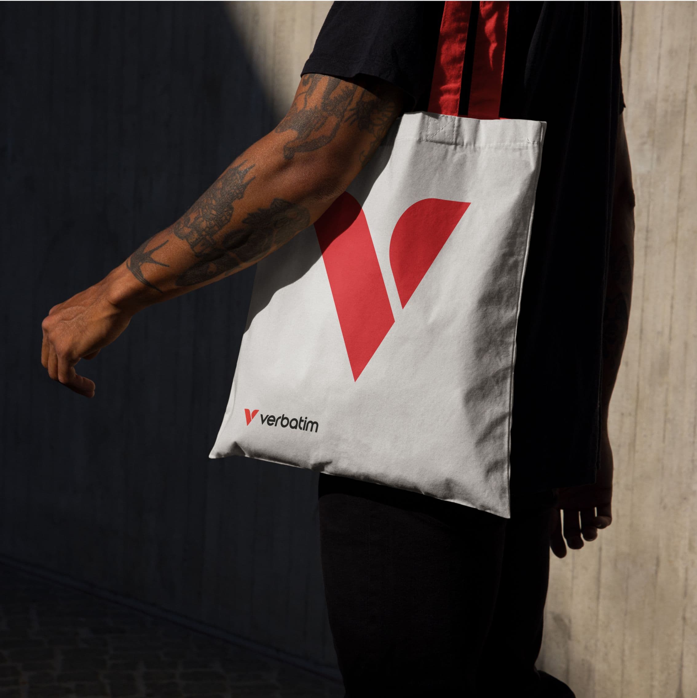
At the heart of WIG’s new identity sits a stylised W logo, built from an abstract visualisation of three mobile phones in perspective. Set within a simple circle and energised with a gradient, it captures both precision and movement. A symbol of connectivity in every environment.
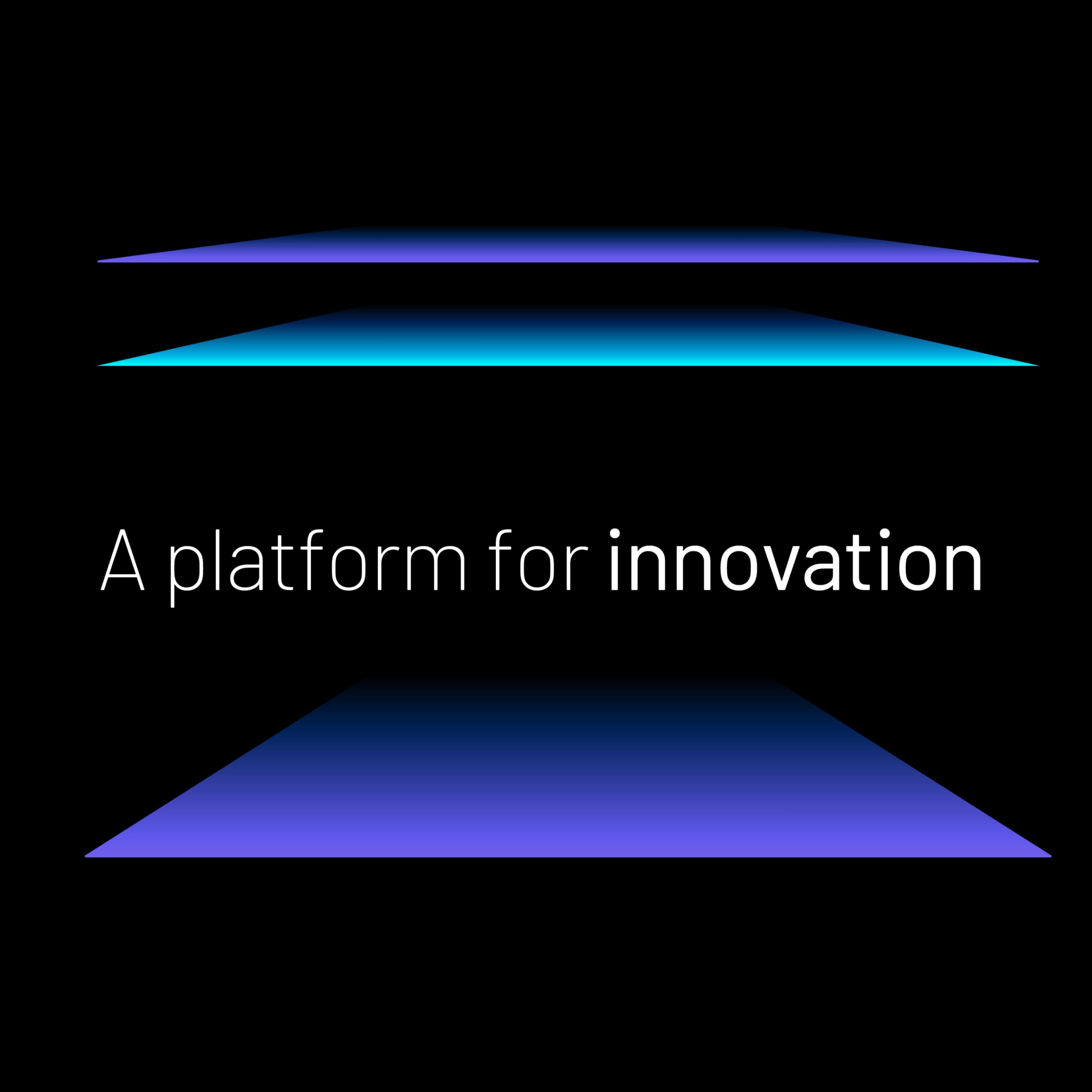
The wider system amplifies that idea. Bold typography gives the brand a sharper edge. A modern palette – productivity blue, connectivity violet, performance orange – channels confidence and momentum. Together, they create an identity that signals performance and connectivity, wherever WIG shows up.


We positioned WIG around a simple, powerful idea. Connecting people and places. It signals their role in enabling performance and productivity in the busiest built environments, from offices to stadiums.
To bring it to life, we defined clear messaging pillars. Premium quality, ultra-reliable service, super-secure networks and right-first-time delivery. Together, they frame WIG as the trusted partner for connectivity that doesn’t compromise. A proposition built for confidence, clarity and growth.


We built a full brand strategy to give the entire WIG group clarity and edge. Key messages. Reasons to believe. Go-to-market ideas shaped for traction. Then we brought it to life through creative concepts – a visual identity system designed to cut through, and a messaging framework built to connect. Tone of voice became a critical layer too. Upbeat, empowering, human and personable. Together, strategy and creativity fused into a modern brand platform. One ready to lead the indoor networks market.


WIG needed to shift from talking specs to showing impact. Because in the end, it’s not about infrastructure. It’s about people. Developers, venue owners and operators all make decisions with end-users in mind: how they work, play and connect. That’s why we built the unifying idea of Human Connection. It reflects the seamless connectivity they deliver and how they operate – through trusted relationships and collaboration. A brand story grounded in people, not just technology.


We applied the identity system to digital environments, designing a new website experience and social media templates ready for fast, consistent use.
Beyond digital, we extended the brand into brochures, iconography and campaign modules. A complete toolkit to keep WIG’s story sharp and seamless across every touchpoint. Flexible, modern and ready to drive engagement.
The transformation was comprehensive. From proposition and positioning to tone of voice, we delivered a full brand strategy paired with a bold new visual identity system spanning logo, typography, colour palette, CGI supergraphics, imagery and iconography. A messaging framework gave WIG audience-specific reasons to believe, while the rollout covered every channel: pitch decks, brochures, templates, social assets and a new website. All underpinned by clear brand guidelines to keep execution consistent and confident.
Dusted took the time to really understand our business strategy and translated it into a creative vision that stayed true to our core brand values while elevating the look and feel of the brand and positioning us as market leaders. Their strategic and creative expertise, smooth delivery and ability to engage key stakeholders made the project run seamlessly. We’re delighted with the results, our new website and brand assets feel fresh, engaging and impactful. I wouldn’t hesitate to recommend Dusted to other businesses looking to evolve their brand.


Let’s build your brand edge.
Schedule a discovery call with our award-winning team to see how we can transform your brand vision into reality.


