

“I’m really anal-retentive”, said Tom Foley as he set everything up for our most recent Peek Talk. He spread some notebooks (for keepsies!) and some interesting little type specimen sheets around the table in an organised and tidy fashion. Satisfied, he welcomed everyone into the room for his presentation, whereupon we all immediately pushed the notebooks aside in preparation for pizza. Sorry, Tom.
Tom Foley is the senior typographic advisor at Dalton Maag, an international typeface design company. They help businesses develop bespoke typography that suits their brand or campaign perfectly. They’ve done work for the likes of Nokia, Intel, Google, Tesco and much more, from SMBs to international corporations. Tom very kindly agreed to come in to talk to us about custom fonts and typography.
Dalton Maag specialises in typeface design and offers three main services: logo refinements, font modifications (modifying existing fonts for specific use by the company), and custom fonts. Tom took us through the development process for creating a custom font for a brand. These are popular with large, international businesses who not only want to make sure their font is personalised and one-of-a-kind but also want to be certain that their font can be applied to different languages’ scripts and is optimised for use in digital formats.
To go into the level of detail Tom went into during his presentation would be to write an incredibly meticulous thesis on the intricacies of typography. He only had an hour, so the information flowed fast and frequent!
One of the first moments of eyebrow-raising awe from Dustedians came when Tom told us how long it took to create a custom font. A recent example of a project took three years. Three years! ‘How could it take so long?’, we thought.
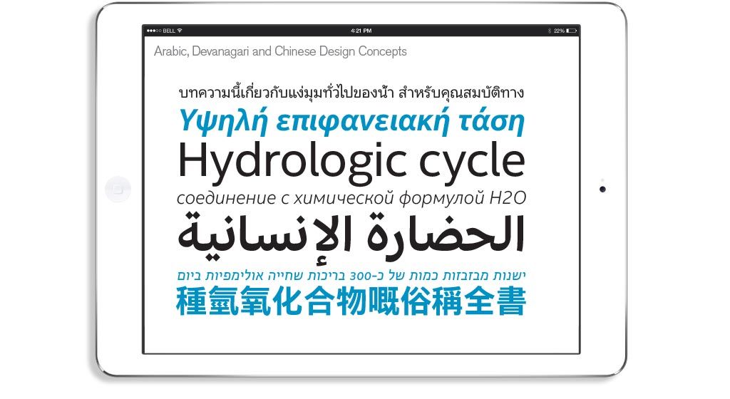
Well, it makes more sense when you consider how much there is to do. Even ignoring the huge amounts of research and ideation (drawing, mostly), there is still the huge task of creating a custom font for our entire alphabet. And the Cyrillic alphabet. And the Greek Alphabet. AND Arabic. AND Chinese. And whichever other font types the client will need. To put that into perspective, the Chinese alphabet alone has approximately 27,000 characters, each of which needs to be individually designed. But what makes it even more challenging is that in order to create a consistent brand expression, the design needs to be applied across all required writing systems. Three years?? How do they do it in so little time?

The sheer level of detail that goes into creating a custom type is incredible. Every minor imperfection that any ordinary designer would notice right away needs to be considered. For instance, kerning. “Everyone knows what kerning is, right?” Tom said to awkward silence from the non-designers in the office. Kerning refers to adjustments made to the distance between specific character combinations in a typeface. There’s an efficient, class-based system to establish the ideal kerning levels between characters, but at the end of the day, they still need to manually check that letter positioning is OK. For instance, the relationship between ‘T’ and ‘o’ is pretty strenuous, we hear.
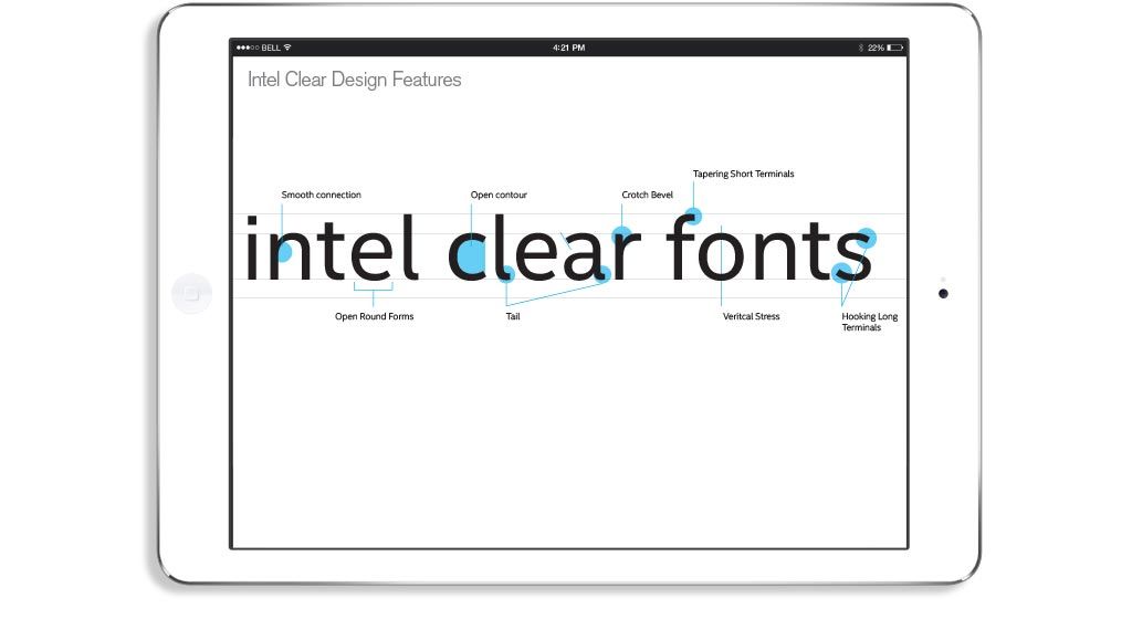
Another example of the mad-level detail that we would never have appreciated if we hadn’t attended this talk was how Dalton Maag would look into the character forms. The tails of the ‘a’ and the ‘l’, or the terminals of letters like ‘s’ and the crotch (tee hee) of letters like ‘r’ and ‘d’. These will often be adjusted and tweaked to achieve the desired brand expression, which then, in turn, needs to be applied to all the other scripts. These other scripts, like Chinese, don’t have letters like ‘s’ or ‘d’, but they have hooks, tails and crotches (tee hee) in their own ways.

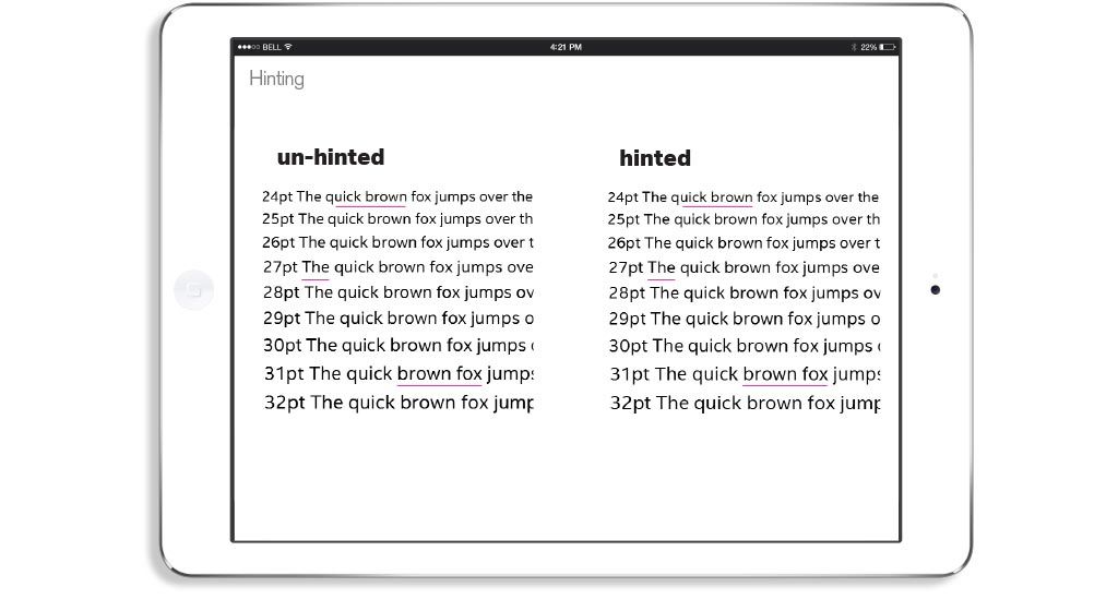
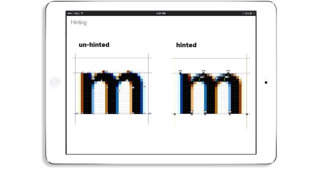
During the execution stage, not only do the fonts need to be developed, but they also need to be optimised for the web. This is called hinting, and it’s how rasterizers display the fonts in pixels (“You all know what hinting is, right?” Tom asks an overwhelmed audience). It’s particularly important now there are so many different screen resolutions out there, from laptop to phone, to watch. Without going into the details of how it works (we’d be here all week), hinting makes sure the type is consistent and legible on every screen. Without it, visible errors can occur, such as in the underlined areas below.

Looking closely, you can see that at 24pt, the ‘c’ in ‘quick’ doesn’t look quite right when un-hinted, as the areas that should be rounded are straight. Also, at 27pt the ‘T’ has a heavy weight to the horizontal line. These kinds of things are noticed by users and are definitely not something a brand will accept after the three-year-long development of a personalised font. This is one part of the process, but not even close to the whole story.

It’s safe to say that there was a LOT to learn from Tom and Dalton Maag. The amount of effort that goes into developing their typography is incredible, and it’ll certainly make you appreciate your fonts more. Tom was barely able to scratch the surface of what goes into developing custom fonts, and this blog has touched on only a modicum of the detail he gave to us. We can only imagine the wealth of knowledge over there at Dalton Maag. Probably similar to Dusted’s knowledge of web design, branding and baking awesome cakes, amirite? High five! … Anyone?
Anyway, thanks again to Tom and Dalton Maag!