At the 2026 World Cup, football boots have become impossible to ignore. From touchline close-ups to slow-motion replays, electric fuchsia is everywhere – streaking across the pitch, flashing under the lights and cutting through the green with unmistakable force.
It is set to become one of the…
Insights.

Dusted Shortlisted for Creativepool Annual 2026
Congratulations are in order! Dusted has been shortlisted for this year’s Creativepool Annual – the creative industry's “Most” award. The “Most” distributed. The “Most” voted. The “Most” shared. The “Most” collaborative... You get the idea. Better still, we’re shortlisted in two categories:…
Job vacancy: Senior Designer
We are looking for a talented Senior Designer to join the creative team, collaborating with creatives, strategists, developers and client services to deliver standout work for our clients. The role As a Senior Designer, you will play a key role in developing high-quality, strategically driven…
Job vacancy: Middleweight Designer
We are looking for a talented Middleweight Designer to join the creative team, collaborating with creatives, strategists, developers and client services to deliver standout work for our clients. The role As a Middleweight Designer, you will create thoughtful and well crafted work for a diverse…
The four tensions reshaping cybersecurity branding in the age of AI.
At Dusted, we spend a lot of our time helping technology and SaaS businesses translate complex capability into clear market advantage. The through-line in our work is simple. If your brand is not distinct, there is no clear reason to choose you or remember you. That is what we mean by Distinctly…
Dusted joins Infosecurity Europe 2026 as sponsor of the Cyber Startup Award.
Cybersecurity is moving faster than ever. So are the pressures around trust, differentiation and visibility. That’s why we’re proud to be sponsoring the Cyber Startup Award 2026 at Infosecurity Europe 2026, taking place from 2-4 June 2026 at ExCeL London. Recognised as Europe’s leading…
Quantum computing and digital trust. What brands should know.
Quantum computing is no longer theoretical. Google has set a binding 2029 deadline to migrate its infrastructure to post-quantum cryptography. The G7 has set 2030–2032 targets for critical financial systems. Every digital platform built on current encryption standards, from banking systems to…
Website rebrand and replatform. Why you should do both together.
Most firms still treat rebranding and replatforming as separate moves. New identity first. Website later. Or the other way around. The outcome rarely holds together. A new brand constrained by old technology. Or a new platform still expressing an outdated story. Investment goes in. Momentum slips…
Law firm website audit. Is your site driving business development?
Professional services firms that establish strong digital foundations reshape how they grow, with websites carrying weight across the full client journey, from first discovery through to conversion and long-term value. When you shift from incremental updates to something more deliberate, the…
The AI trust gap. Why more people use AI but fewer people trust it.
78% of Americans now use AI-powered tools. Yet 55% believe AI will do more harm than good in their daily lives. Only 21% trust AI-generated information most of the time. In short: Usage is rising. Trust is falling. For any brand integrating AI, this is not a technology gap. It is a trust gap.…
Post-quantum web security. What your digital platform needs now.
Quantum computing will change how encryption works across your digital platforms. Not all at once. But in the places that matter most. Secure connections. Login credentials. Certificates that prove your site is legitimate. Engineering teams don’t need to react overnight. But they do need to start…
Beyond the chat bar. Designing SaaS interfaces for the agentic era.
PostHog made chat its default homepage. Linear embedded an AI agent across the app. Attio moved further towards agent-first interactions. Three of the most design-aware SaaS products in the market, all pushing conversational AI closer to the centre of the experience. The response was immediate.…
Building institutional trust. Why generic branding weakens financial services brands.
There’s no shortage of noise in fintech branding. Big claims. Disruption narratives. Technology framed as the answer to everything. In financial services, that approach erodes confidence. Between 2020 and 2026, the fintech market split. Capital began flowing toward businesses with clear…
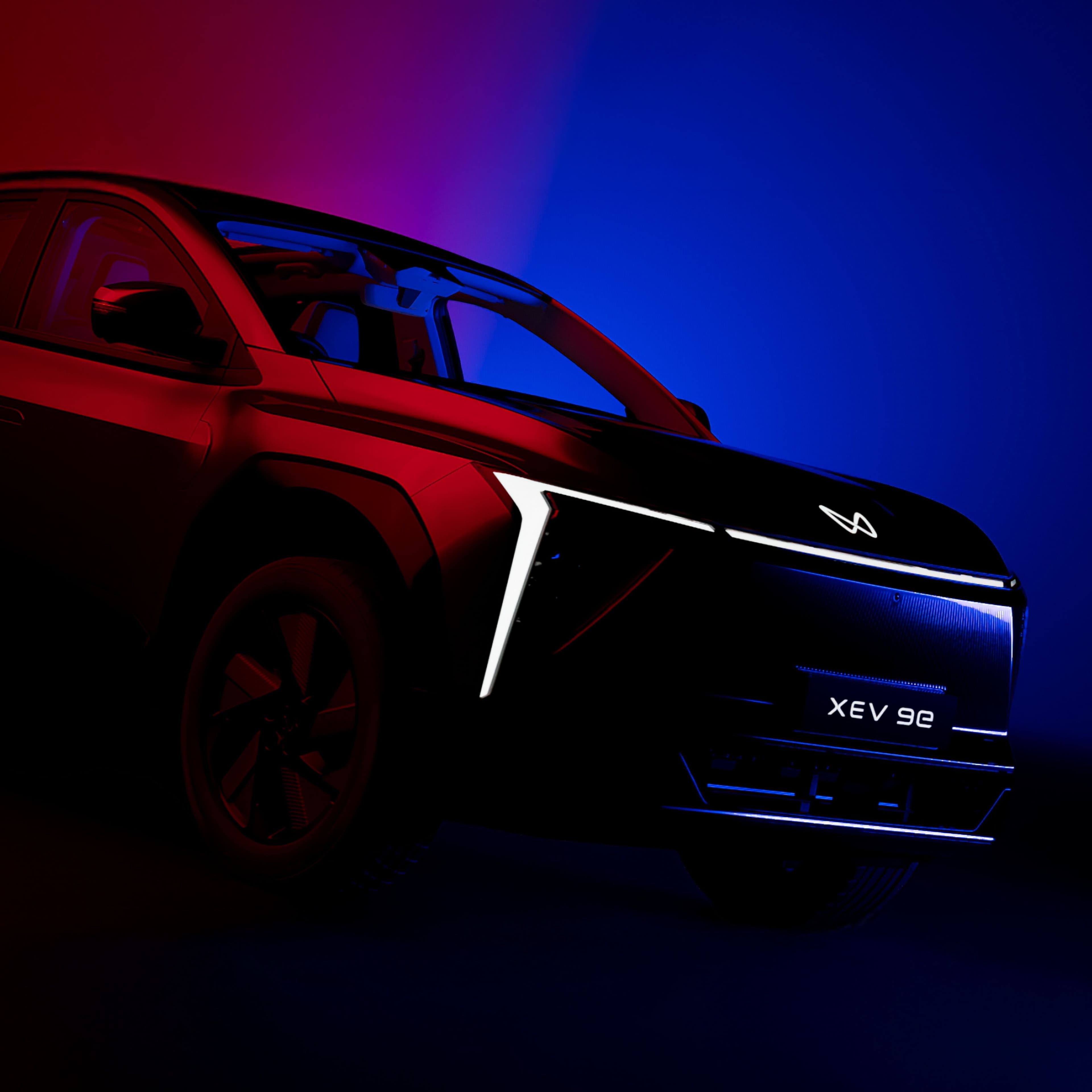
Automotive gold for Dusted at Transform Awards with wins for Mahindra and Cubic³.
Another year at the Transform Awards Europe. Another gathering of the industry’s most ambitious thinkers, designers and brand leaders. And another moment to reflect on the work that doesn’t just shift perception, but changes the trajectory of entire categories. For 17 years, Transform has…
From growth to exit. The ultimate playbook for fintech scale-ups preparing to sell.
Branding accounts for more than 30% of market value in leading companies, with over three-fifths of CEOs attributing more than 40% of valuation to brand and reputation. In a market where strategic acquisitions made up 78% of fintech exits in 2025, these facts go beyond marketing theory. That’s…
The hidden cost of design debt on SaaS roadmaps.
Your CFO raises a familiar point. The same button exists in five different codebases. Each version does the same job. Each one carries its own cost. You feel it in delivery timelines. In resourcing. In all the duplication that sits behind everyday product work. Design debt rarely announces…
Transforming brands in hard-to-move categories. Lessons from our award-winning work.
With the 2026 Transform Awards Europe approaching, I sat down once again with Dusted’s Creative Director, Paul Marten, to reflect on a different question from our last conversation. Not simply what makes brand work award-worthy, but what happens when that work takes place in categories that rarely…
What it takes to create award-winning brands. Reflecting on our past wins with Creative Director Paul Marten.
The Transform Awards recognise the most effective brand transformations. And over the past six years, Dusted’s work with ambitious clients has earned us more than 20 awards across sectors ranging from technology and life sciences to consumer electronics. With the 2026 Transform Awards Europe…
Practical strategies for scaling design systems for enterprise growth.
Design systems help enterprise teams move faster, stay consistent and scale products with confidence. But components alone don’t deliver that value. Success depends on governance, shared ownership and strong developer adoption. When organisations treat design systems as infrastructure, the…
Where care meets commerce. medtech’s defining moment at CES 2026.
CES 2026 landed at a moment of real consequence for medtech. As the world’s most influential technology showcase, it has become a proving ground for how innovation shows up in real life. Nowhere was that more evident than at the Digital Health Summit, where healthcare stepped decisively into the…