
Once a stamp of ownership, now a dynamic expression of identity. In a world of fluid interfaces and fast-moving feeds, leading brands are pushing the limits of logo design. What logos can do and how they behave.
This article unpacks what the future of logos looks like in an interactive world, with insights on how we approach logo design at Dusted. Because, as strategically-led creatives who’ve crafted identity systems for some of the most ambitious brands across fintech, medtech, telco, automotive, consumer electronics and IoT, we have a few things to share about logo design.
Micro space, macro impact.
Logos show up wherever the brand does, from the largest billboards to the smallest icons. Think favicons, app tiles and agentic thumbnails. At just 16×16 pixels, they carry the full weight of brand recognition. Especially on mobile, where screen space is scarce and attention even scarcer, they’re shortcuts.
That’s why brands are pushing harder on what these tiny canvases can do. With barely any room to play with, every pixel has to work harder. Every decision has to count. And increasingly, motion is doing the heavy lifting.
Animated logo marks. App tiles with energy. Motion gives brands a new layer of expression, injecting personality and meaning into the most compressed formats. What used to be static symbols are now sensory signals. Signifiers of story, value and emotion.
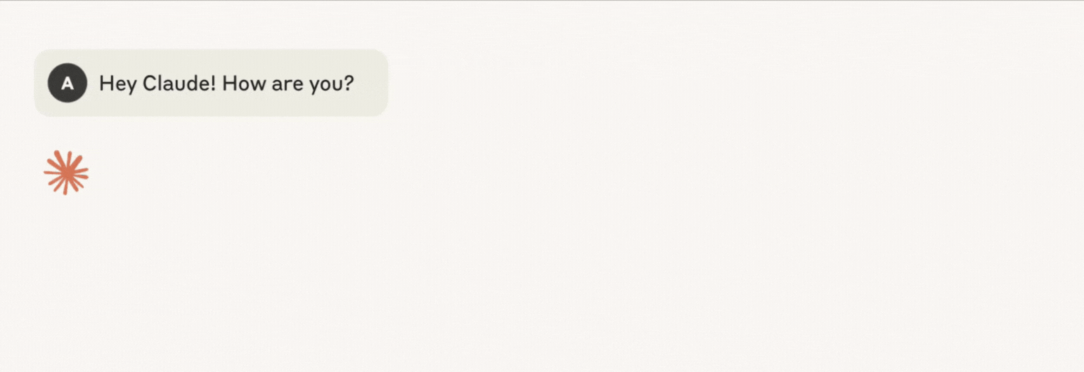
Take Claude’s logo, for example. Its icon is irregular, organic, almost floral. Its earthy terracotta palette counters the coldness of machine intelligence. Combined with the asymmetry of its form, it conveys warmth and creativity. The animation captures attention, making the most out of the digital space it occupies. It adds a human touch, a life-like pulse.

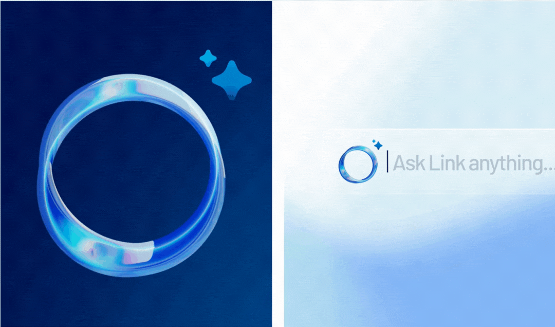
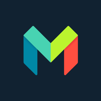
We took a different route with the design of Link, a decision underpinned by strategy. Link is SS&C Intralinks’ proprietary AI engine for dealmakers.
SS&C Intralinks earned its reputation on security. It’s in their DNA. That matters because in enterprise fintech, brand trust is currency. And trust in AI doesn’t come easy. By researching their target clients, we uncovered that they didn’t want a virtual assistant with a smile. They wanted a serious, intelligent engine at the heart of their tech system. One they could rely on.
So, we designed a closed, iridescent ring. A visual metaphor for both fluid intelligence and walled security. It represents an AI that flows seamlessly through every service and system, connecting and adapting without compromise. A contained, closed-loop architecture. Unlike open-source AI, this is secure by design.
In motion, the mark tells a deeper story. A constant, rhythmic pulse. The steady flow of information. An infinite loop of learning and refinement. Always moving. Always enriching. It signals intelligence at work. Calm, precise, quietly powerful.

The palette is cool and considered, evoking professionalism and confidence. A simple logo built from user insight, shaped by context, and designed to scale across UI environments without losing clarity.
Built for motion.
Link demonstrates how motion is identity in action. As brand interactions become more dynamic, motion turns static marks into living signals of personality, purpose and promise.
Motion also transcends language and culture. Where verbal nuance can get lost, kinetic design connects. This makes motion identity an invaluable asset for global brands: universal, human, and emotionally legible.
But it works best when it stems from strategy. Movement for movement’s sake won’t land. To engage and convey a greater meaning, it has to be intentional. Anchored. True to the brand values and the experience it seeks to express.
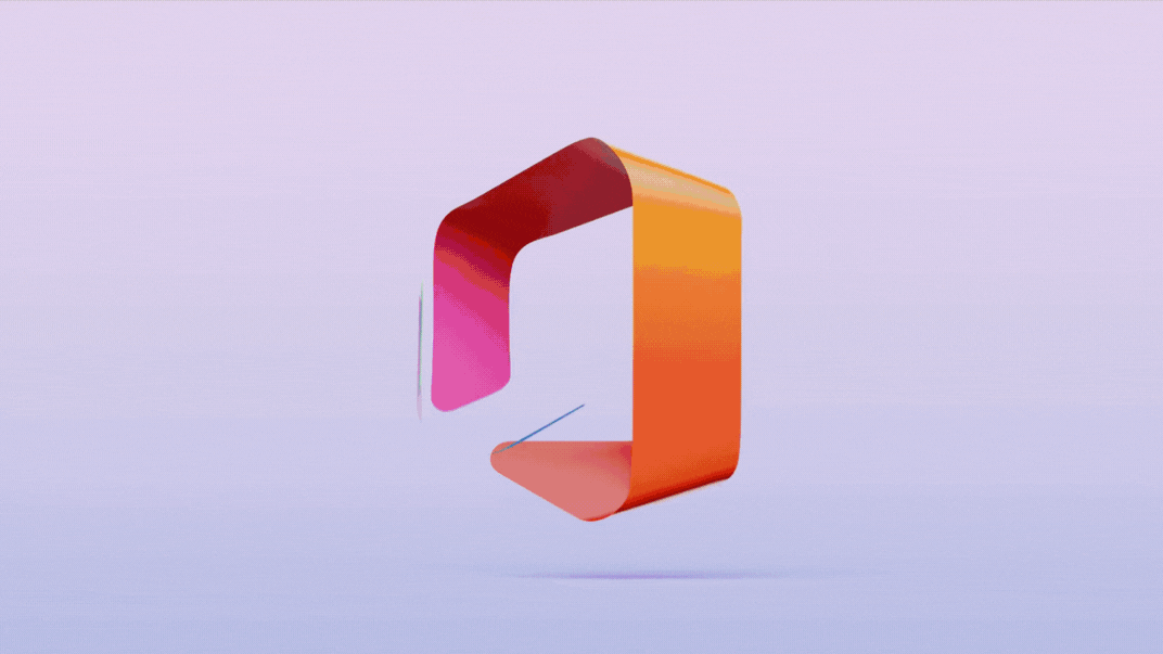
Like Microsoft’s shift from Office to Microsoft 365. The new animated logo, a 3D loop anchored in metaphors of interlinking and connected systems, visually reinforces the shift from standalone tools to an integrated digital workspace.

(Microsoft 365 logo. Source: svgator)
Conversely, Here (formerly OpenFin) also stands out through its animated logo. Built on Google Chromium and used by 90% of Tier 1 financial institutions, Here is a disruptor in the enterprise software space. And the brand needed to express that position.
We created an animated logo that mimics the behaviour of its product. Motion as metaphor. Built on a browser-based foundation, we used the universal shape of the browser window and the three-dot icon as core visual cues. Instantly familiar, instantly recognisable. It signals a workspace that’s agile, active and accessible from anywhere. One that lives where users already are.

In a space dominated by static, corporate branding, Here’s animated identity feels expressive, alive. The motion design embodies interoperability. It sets a mood. A lightness. Playful movement disrupts the sterile expectations of enterprise SaaS, helping Here feel younger, more fluid, more human. It invites users into a world where work feels more fun
You’ll find plenty of bouncy, overcomplicated animations online, but we believe in a smarter approach. We treat animated logos as storytelling. Simple, thoughtful, and designed with purpose. It’s a collaborative process that takes exploration and thinking. Anyone can make a logo move, but making it move with personality and intention is what sets great design apart.
Nico Cagnini, Motion Designer at Dusted
Done right, motion transforms identity from fixed to dynamic. From decorative to behavioural. And when it’s aligned with the story a brand wants to tell, it becomes one of the clearest, most compelling ways to tell it.
And this is just the beginning. As AI unlocks smarter, more responsive systems, animated logos will also adapt. React. Perform in real time. We’ll explore all this and more as part of our WAVE series.
From stamps to systems.
For modern logos to be used, scaled and deployed across an ever-expanding universe of digital touchpoints, they need to belong to a design system rooted in brand character, promise and experience.
A design system is a connected, coded style framework that governs how a brand shows up consistently, cohesively, everywhere. From buttons to banners. Platforms to products. It ensures a brand’s identity and behaviours are baked into its digital DNA.
At the heart of this evolution is the rise of design tokens – reusable, machine-readable snippets that represent design guidelines. Colour, spacing, motion, typography and, increasingly, the logo itself, are stored as variables and applied programmatically, redefining what identity means at scale. It’s a shift from asset to asset class.
Referenced like code. Rendered cleanly across any interface without being re-exported or manually resized. That means faster updates, global cohesion, and real-time adaptability.
We built this kind of flexibility into Cubic³, the connectivity software powerhouse helping global OEMs unlock the full potential of software-defined vehicles. The cubed "3" signals growth. One contract. One intelligent platform. One exponential leap in value. We designed the symbol to carry narrative weight. Value, multiplied by itself. A visual shorthand for what Cubic³ enables in the market.
And because it lives inside the brand system, this “3” brand symbol adapts fluidly, from headline device to naming convention. A single source of truth. Strategy at the core. Execution at scale.
A major design advancement in Cubic Telecom’s transition to Cubic³ was simplifying the brandmark from three colours to a single, ownable hue, creating a confident, unified identity. The introduction of the distinctive “cubed” symbol and custom logotype brought fresh, dynamic energy. This symbol evolved into a custom typeface, allowing Cubic³ to literally own the words they use. Like Apple’s “i” in iPhone. But instead of disappearing as a prefix, Cubic’s symbol becomes a defining part of the word, reinforcing their new strategy with every use.
Calum Houldsworth, Senior Designer at Dusted
Symbol-first storytelling.
As shown with Cubic³, logos can be powerful vehicles for brand storytelling. They distil purpose, proposition and ambition into a single shape.
Logos have long carried cultural power, evoking emotion, embedding meaning, and creating instant recall. And in 2025, as branding leans into simplicity and systemisation, that symbolic power is more vital than ever.
According to LogoLounge’s 2025 trend report, many brands are turning to geometry to express a story. This has been the case for a while, and now it’s being reinforced by some of the biggest brands.
For example, in fintech, Monzo’s logo displays interlocking forms that signal connection and forward motion. Its clear, modular build reflects a bank made for the digital age.

(Monzo’s logo. Image source: Brandfetch)
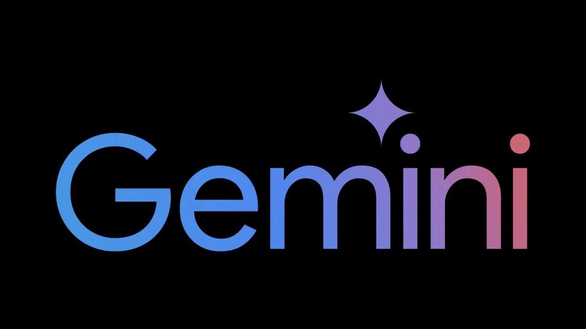
Gemini also takes the same geometric discipline and points it towards the future. The four-point star carries balance and precision, while the subtle depth hints at depth and discovery. Paired with a clean wordmark, it speaks to a platform designed for exploration and control in equal measure.

(Gemini’s logo. Image source: Creative Bloq)
Two different stories. Both told through shape, rhythm and intent.
Each example tells a visual story with purpose. Whether applied to an app icon or stretched across a screen, these marks speak clearly.
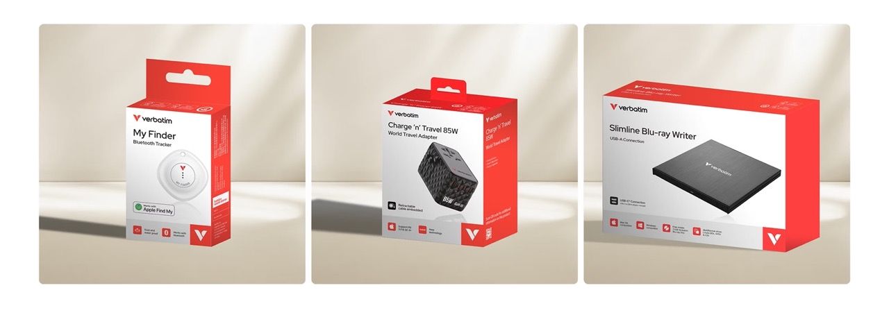
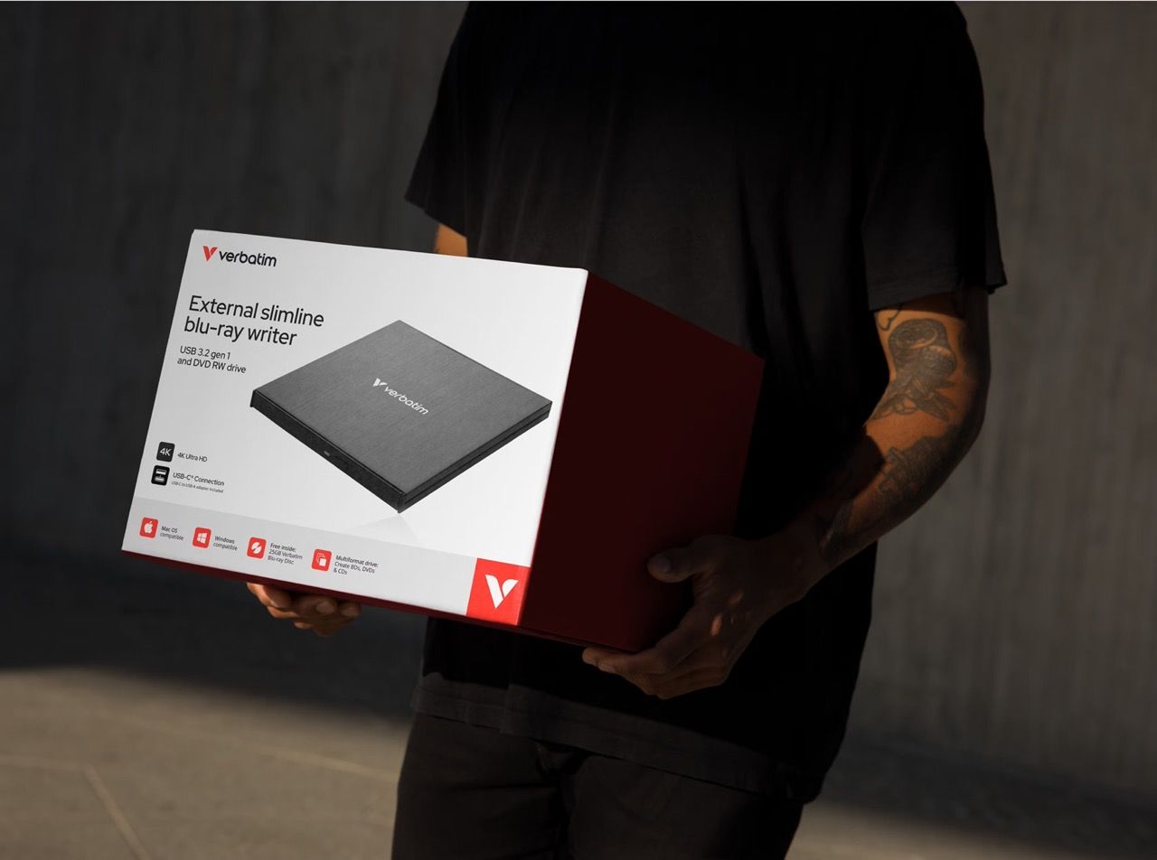
We brought the same mindset to Verbatim, a household name in the consumer electronics space that pioneered floppy disks back in the day. They needed to connect with a new generation. And we helped them do just that through our rebrand.
Leading product brands use a symbol-based brand story. Think Apple’s black logo, Leica’s red dot… These are simple, shorthand narratives. They immediately connect and communicate the emotive brand qualities. Verbatim’s logo is designed in line with this approach. It feels active, so it fits the brand position of 'Anywhere. Everyday' as well as working beautifully when machined into the fabric of the products they design and build.
Paul Marten, Creative Director at Dusted
In creating their brand identity, we devised their logo. A stylised "V" with a dual-wing structure, angled forward to express movement and possibility. The clean construction makes it highly legible. The curved upper edge softens the tone as a nod to their new human-centred design.


The colour shift tells its own story. Coral red replaces corporate blue with energy and warmth, signalling a brand moving from utility to personality. Everywhere it appears, the Vision symbol does the heavy lifting, narrating Verbatim’s evolution.
Let's get things Done & Dusted.
Every logo needs to carry its brand. A mark with meaning baked in. Motion-ready. Pixel-clear. Adaptive by design.
Dusted is a brand design agency. We design logos that behave. Flexing across every screen, platform and interaction. From 16px favicons to full-screen animations. From a standalone symbol to a full design token embedded in your brand ecosystem.
We base our approach to logo design on your needs. Prototyped on merch. Visualised in product UIs. Stress-tested in motion. We don’t just ship assets. We build identity vehicles.
So whether you’re a legacy player looking to signal reinvention, or a category disruptor needing to codify your difference, we’ll help you create a logo that cuts through. Everywhere it shows up.
Contact us now. Ready when you are.