

The Transform Awards recognise the most effective brand transformations. And over the past six years, Dusted’s work with ambitious clients has earned us more than 20 awards across sectors ranging from technology and life sciences to consumer electronics.
With the 2026 Transform Awards Europe approaching, I took the opportunity to sit down with Paul Marten, Dusted’s Creative Director, and reflect on our previous award-winning work.
But that is not the whole story we are most interested in telling here. The more useful question is what sits behind work that gets recognised in the first place. What turns a strong rebrand into the kind of work that stands out, resonates and endures.
“Transform is a branding award, but, equally, the awards are called ‘Transform’,” Paul tells me. The clue is in the name. What judges are looking for, he believes, is the scale of the shift. The distance between what a brand was and what it became, the clarity of the idea behind that change, and the effect it had once it hit the market.
The secret behind creating award-winning brands.
For Paul, award-winning brands start with a simple principle:
Our goal isn’t to win awards. We set out to create the best work possible for our client. The award is just a by-product of that.
Paul Marten, Creative Director at Dusted
That keeps the focus where it should be. On the work. On the ambition behind it. And on the quality of partnership required to get it over the line.
Because award-winning work is rarely the product of agency craft alone. It takes a client willing to move. Willing to commit. To back a sharper proposition and a more distinctive story than the category usually allows. “The projects that we enter into awards also have to have the level of client ambition that matches our ambition,” Paul says. “They were willing to make a change. They were willing to be way more distinct within their marketplace and tell a story that is compelling and Distinctly Different.”
That is the real pattern. Not a formula, but a set of conditions. Brave clients. A clear strategic idea. Creative conviction. And alignment across the whole team.
That’s a key part of award-winning work – total partnership and total alignment between strategy, creative, delivery and production. Everybody is working towards that ultimate goal.
Ahead of the 2026 Transform Awards, four projects bring that into focus. Different sectors. Different pressures. Different audiences. But all of them show what happens when a brand stops following the rules of its category and starts expressing something sharper and clearer.
Here. Shifting enterprise tech from product pitch to human pull.
Business-critical challenge: Integrating AI into the brand proposition.
There was a period when a lot of enterprise tech looked and sounded much the same. Clean interfaces. Corporate blue. Generic stock imagery. The usual functional language about capability, performance and integration. Efficient, perhaps. Distinctive, rarely.
Here had no shortage of product substance. What it needed was a story with more pull. A brand that could move beyond describing what the platform did and start expressing why people would actually want it in their working lives.
Paul is clear on where the shift came from. “The judges are constantly looking for something that stands apart in the market and Here absolutely does that,” he says. “It’s a technology platform brand, but yet it feels so vibrant.” That vibrancy was not decorative. It came from reframing the proposition around benefit and experience, rather than function alone. “If you move into the space where you’re talking about how you make your client’s day better and their world more exciting and more engaging, you have an opportunity to create a brand that’s full of energy and dynamism and distinctiveness.”
That thinking gave rise to “Everything works right here,” a proposition rooted in flow, ease and momentum. From there, every part of the identity system played its role. Typography, colour, iconography and tone all helped create a brand with character. One that stepped cleanly away from category convention and into something more vibrant and, so, more memorable.
As for Dusted’s collaboration with Here, Paul puts it plainly: “We both agreed that the brand needed character. It needed to step outside the tech box.” And that is exactly what gave the work its edge. In a sea of brands describing software features, we set out to challenge convention, creating a brand that instead promised a better working world.
For the client, this shift created clearer differentiation in a crowded market and gave the business a story that customers and stakeholders could feel. That is often where the strongest transformations begin. Not with what a product is, but with what it changes for the people using it. And because of this, Here is now trusted by 90% of global financial institutions, becoming the first enterprise AI browser within its market.
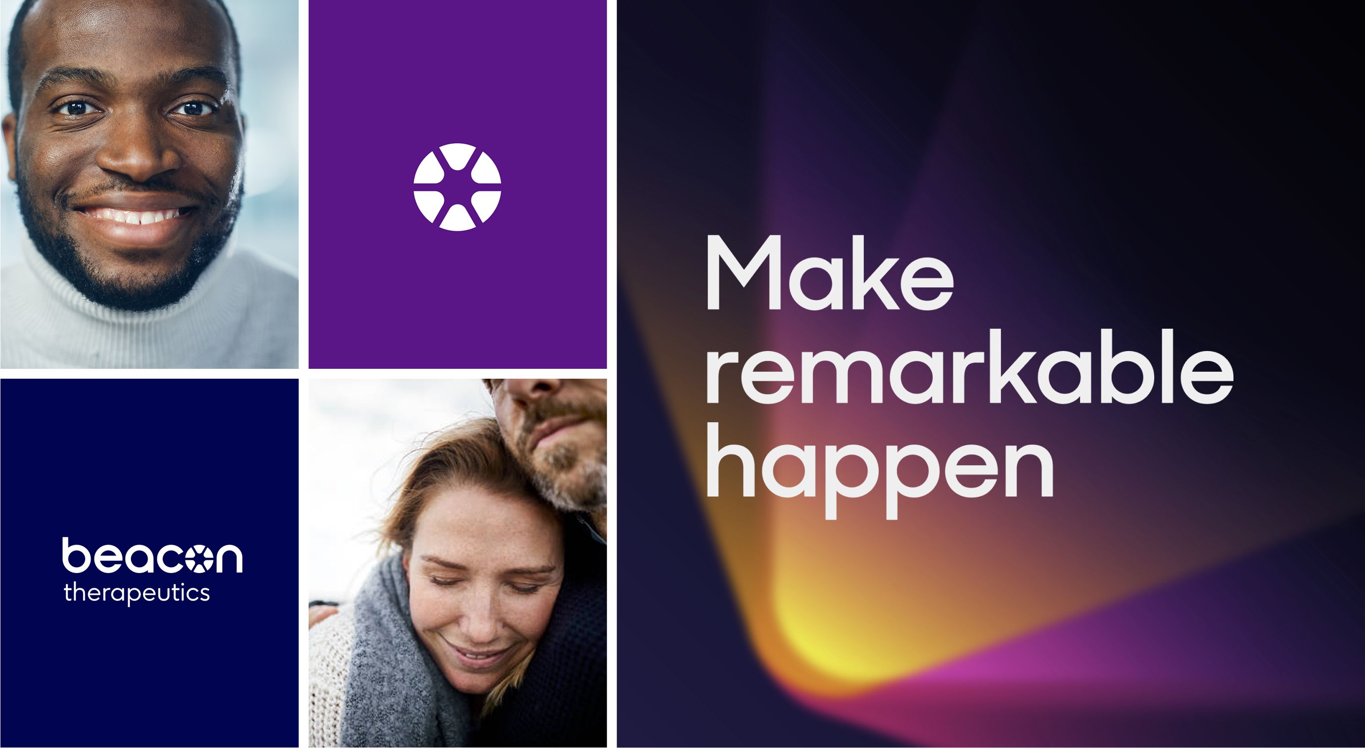
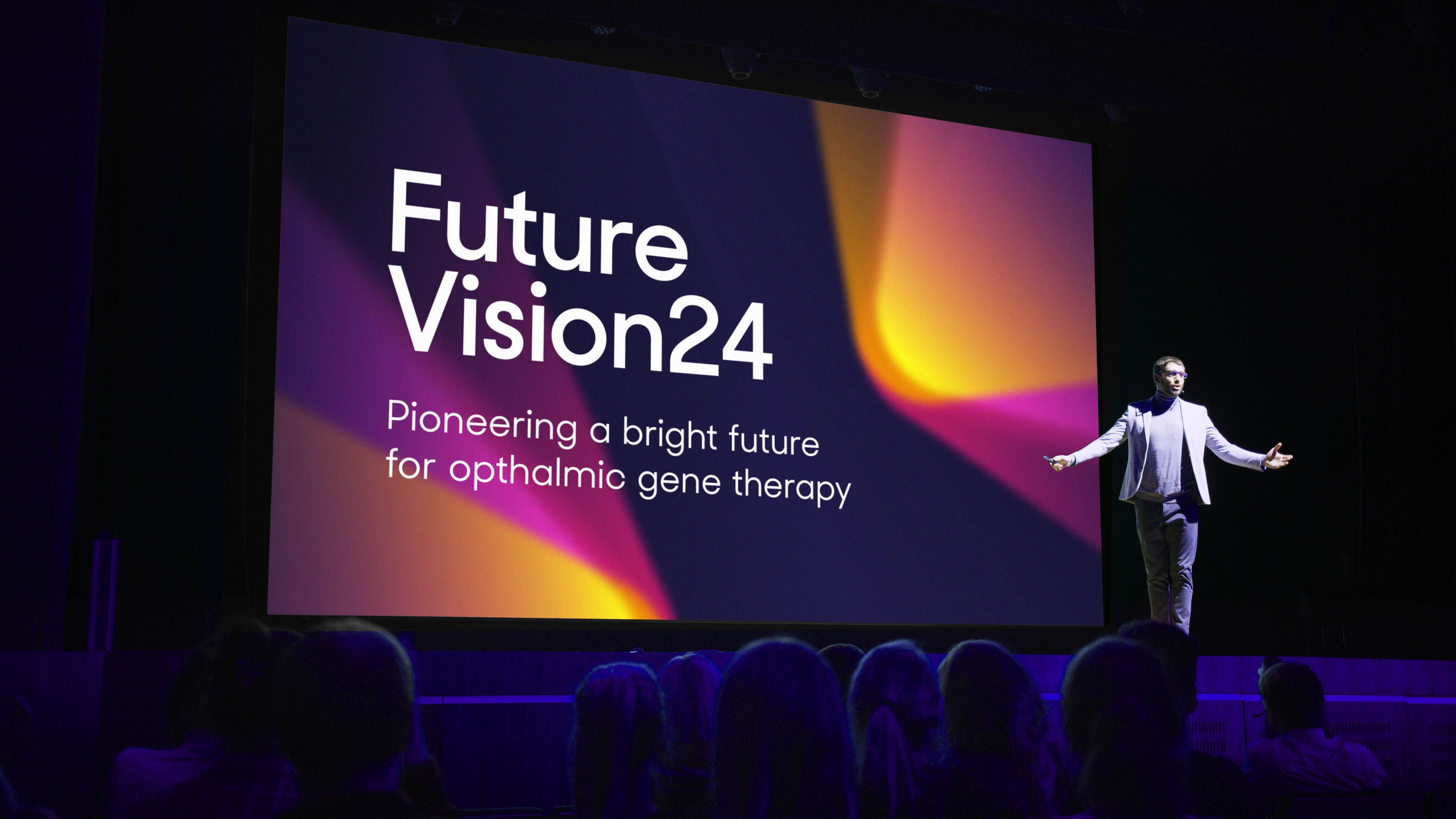
Beacon. Turning a story of fear into a brand built on hope.
Business-critical challenge: Creating a premium brand positioning.
Some briefs ask for precision. Others ask for nerve. Beacon required both.
The business works with retinal gene therapy, a field shaped by some of the most emotionally loaded language in medicine. One phrase, used around the diagnosis itself, stayed with Paul from the outset: “waiting for darkness”.

That was the context. Young people facing progressive sight loss. A category full of cold scientific codes, laboratory imagery and clinical distance. The obvious route would have been to follow that lead and lean into science. Dusted went the other way.
“What probably enabled us to do something quite different and brave,” Paul says, “was the subject matter itself.” The darkness of the diagnosis made the strategic opportunity clearer. The science offered genuine hope. The brand had to express that. “We managed to create a brand proposition that was all around hope and lightness and brightness and positivity because the work they were doing offered that. It offered light at the end of the tunnel.”

That belief shaped everything, beginning with the name. Beacon became the signal. The ray of light. The marker of forward movement. From there, the wider brand language embodied the same emotional truth. Colour, tone and visual expression pushed decisively away from biotech’s familiar codes.
The status quo in that biotech market was very science-driven, very academic looking, very cold. We were the complete opposite. Human. Emotional. Positive. Hopeful. Vibrant.
That contrast is what made the work land. It was not optimism for optimism’s sake, but rather optimism grounded in what the treatment itself could make possible. The brand did not manufacture hope. It gave form to the hope already present in the science.
That is why the transformation feels so complete. It moves from fear to possibility without losing credibility. And for the client, it proved that serious categories do not need to look distant to be trusted. In fact, the opposite can be true. When the human truth is strong enough, expressing it clearly can become the boldest move of all.
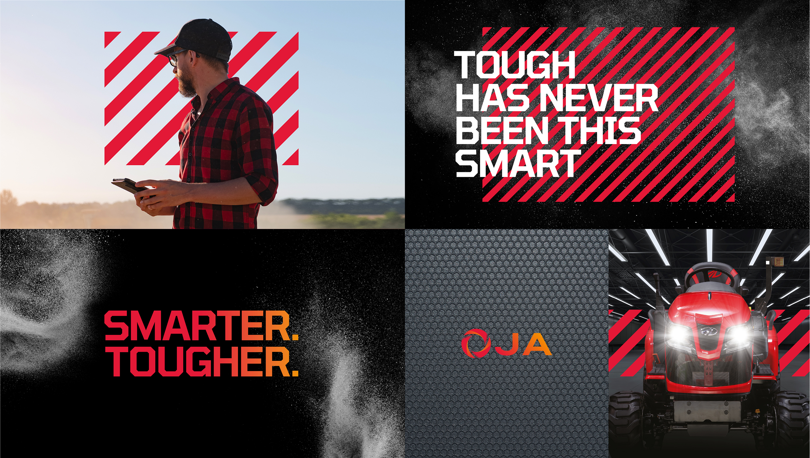
OJA. When a functional product becomes a story people can feel.
Business-critical challenge: Adapting the brand for a new market.
Agricultural technology does not usually trade in emotion. It trades in function. Power. Reliability. Output. The language is practical because the machinery is practical. Which is exactly why OJA stood out.
The challenge was not a lack of innovation. It was how to tell that story in a way that created cut-through. The product brought advanced technology into a category that tends to communicate in mechanical terms, and our task was to give that innovation a stronger narrative frame.

For Paul, that was the heart of it. “The most compelling thing about OJA was the challenge of emotionalising the product,” he says. “It was quite a difficult thing to do.” That emotional shift came through the name first. OJA, drawn from Sanskrit, carries associations with vitality, power and the origin of change. It turned a technical offer into something with energy and meaning.
That mattered because without it, the story risked collapsing back into a list of components. “Otherwise, we were just talking about a lot of technical components that had been added to a very agricultural piece of tech,” Paul says. Instead, the brand framed the innovation as a new force in the category. A source of dynamism, productivity and forward motion.
That sense of energy ran through the verbal story and the activation that followed. The result was a brand that stayed true to the seriousness of the technology while giving it a more memorable presence in market. Not softer. Stronger. More resonant. Easier to grasp.
“In a very emotive way,” Paul says, “we told the story around the offering that this was a new powerhouse.” That is the move that changed the work. It lifted the product out of the usual mechanical conversation and gave people something more compelling to connect to.
For the client, that meant clearer understanding and stronger differentiation. The technology still did the heavy lifting. But the brand gave it pace, meaning and cultural stretch. In categories where everyone talks about function, emotional clarity can be the thing that gets remembered.
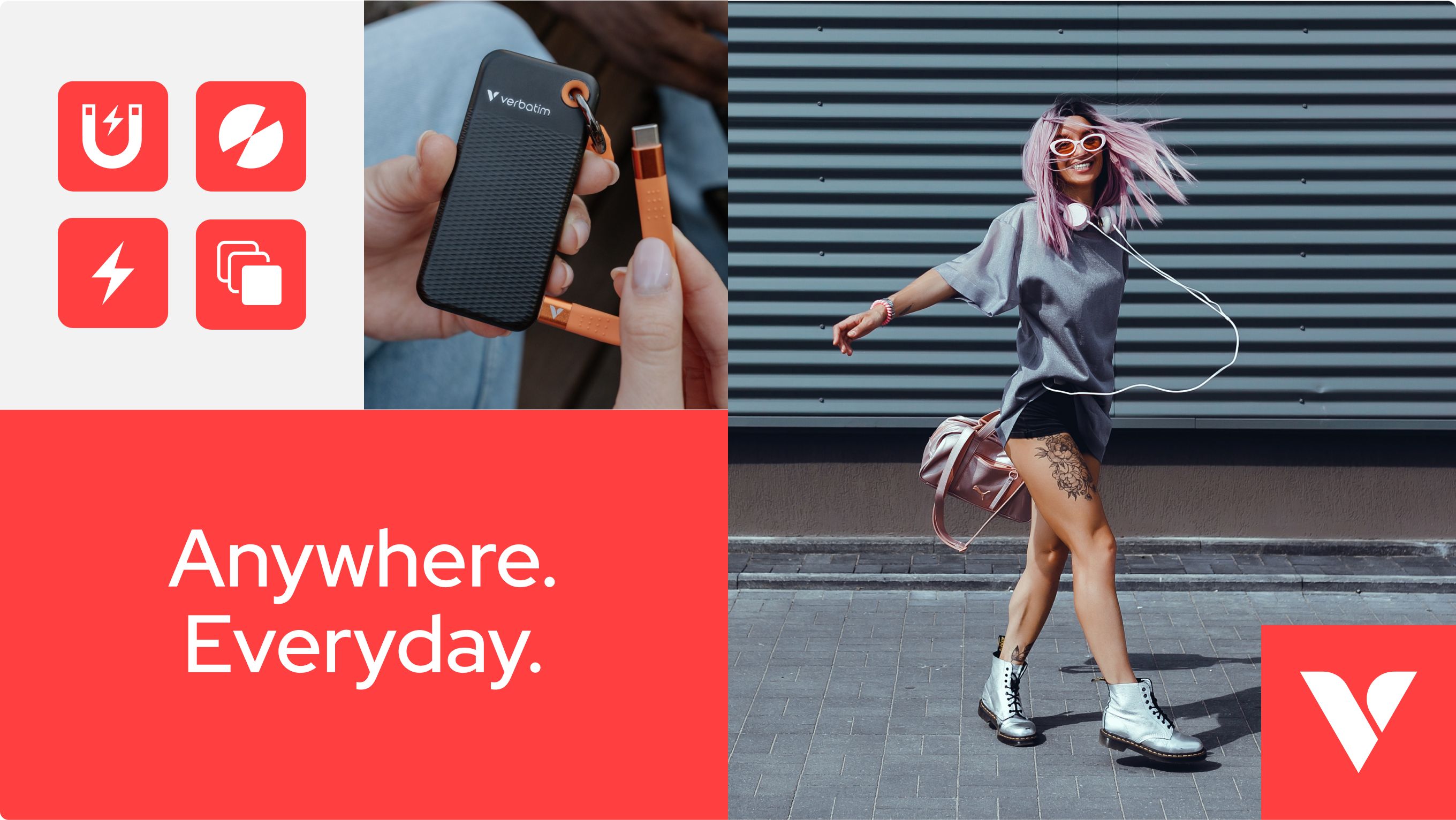
Verbatim. Reintroducing a legacy brand to a market that had moved on.
Business-critical challenge: Modernising a legacy brand.
Heritage can be an asset. It can also be a burden, especially when the market you are moving into has little memory of what made your name matter in the first place.
Verbatim had been part of the digital age for decades. Floppy disks. Optical media. Data storage. A brand with real legacy, but one tied to a chapter of technology that younger audiences had largely skipped. As the business expanded into accessories, peripherals and gaming, “[t]hey were in a kind of dilemma,” as Paul tells me. The move created a way forward, but it also demanded a very different kind of brand presence. “It gave them an opportunity to completely address a new audience like Gen Z in a very, very different way.” So, a simple refresh would not do. They needed a complete reintroduction.
The strategic response was to reposition Verbatim around everyday mobility and relevance. “Anywhere. Everyday.” captured that role cleanly. Not static storage. Technology in motion. Technology that fits the rhythm of modern life. Their products have become an everyday essential in modern digital life, even more so for Gen Z audiences, for whom digital connectivity is deeply embedded in how they live, work and move. That sense of being essential carries a powerful emotional pull, rooted in need, trust and dependability.

From there, the identity had to do more than look contemporary. It had to feel emotionally legible to a new audience. Paul points to the wider influences that informed the thinking: lifestyle brands, travel brands, consumer tech brands, even digital banks with a new-generation sensibility. The point was not to imitate any of them, but to understand how modern brands build desire, familiarity and everyday relevance.
That came through in the lifestyle-led storytelling, the clarity of the design system, and the role of colour as a unifying device across a broad product range. It also came through in the decision to move towards a more symbolic brand asset. “The V Vision mark,” as Paul describes it, helped create a shorthand the brand could own across packaging, platforms and products. Cleaner. More flexible. More immediate.
Rather than polishing nostalgia, our work rebuilt relevance. Taking a name with history and making it meaningful to people who had no reason to feel attached to that history.
For Verbatim’s leadership team, the result validated a more ambitious strategic move. The business was no longer framed by what it had once been known for. It had a clearer place in the present. And that is often what award-recognised repositioning comes down to. Not preserving legacy for its own sake, but using its weight to make a brand matter again.
We can’t thank the team at Dusted enough for their exceptional work in bringing to life our new identity, tagline, packaging, website, supporting graphics, and launch video. They understood exactly what we needed, and their creativity and professionalism were outstanding, delivering everything in an impressively quick timeframe that allowed us to unveil our new look at Computex. We couldn’t have asked for a better partner in this endeavour.
Jonathan Colbourne, Marketing Communications Manager at Verbatim Europe
We win awards. For our clients.
Across these four projects, the common thread is not style alone, but transformation with intent.
Each client was ready to move from where they were to something clearer, sharper and more distinct. Each project was built on a single-minded idea strong enough to carry strategy, identity and activation together. And each one depended on a client relationship that gave the work room to be bold.
That matters to Paul. He is quick to resist the agency myth that great work is made in isolation. “What people don’t want to see is arrogance,” he says. “It’s not just us in isolation that creates award-winning work.” The best outcomes come when belief runs both ways.
We believed in their business. They believed that we understood their business. And they absolutely believed where we thought they could take their business from a brand positioning.
Paul Marten, Creative Director at Dusted
That is also why awards matter commercially, not just creatively. They give clients something independent and tangible. Validation. Proof. A way to show stakeholders, boards and internal teams that the leap was worth making. As Paul puts it, “Bad work doesn’t win awards. It’s only good work that wins awards.” Which means recognition can strengthen the internal case for ambition, unlock momentum and reinforce the judgement behind the decision.
It only works, of course, if the work itself works. That is why effectiveness matters in the way Dusted thinks about recognition. The entry is never only about how something looks or sounds. It is about what changed. What landed. What it made possible. Because design on its own will always carry an element of subjectivity. Results give it weight.
That is the standard we hold ourselves to. We do not start with awards in mind. We start with the work. With the ambition. With the opportunity to create something that gives a client clearer differentiation and stronger brand value. When that happens, recognition can follow.
And when it does, it proves something bigger than creative taste. It proves the power of a brand made distinct on purpose.
Let’s get things Done & Dusted.
If your brand has outgrown its story, lost ground in market or needs to signal a more decisive next move, let’s talk. We work with ambitious teams to sharpen positioning, build distinctive identities and create the kind of change that moves businesses forward. The edge that builds brand value.
Contact us today to see what a more transformative brand could do for yours.
Ready when you are.