

With the 2026 Transform Awards Europe approaching, I sat down once again with Dusted’s Creative Director, Paul Marten, to reflect on a different question from our last conversation. Not simply what makes brand work award-worthy, but what happens when that work takes place in categories that rarely move at all.
These are the sectors shaped by rigid conventions. Technical language. Functional messaging. Visual systems that have barely shifted in decades. In many of them, the same patterns repeat again and again. Which is precisely what makes transformation harder. And more valuable when it happens.
“Transform is a branding award,” Paul tells me. “But equally the awards are called ‘Transform’. The difference between what the brand was and what it becomes is a key part of that.”
In the projects that tend to resonate with judges and markets alike, the shift is unmistakable. And for each and every one of our award-winning work, “[t]here’s light and day between the brand we were approached with and the brand we delivered,” he says.
But that kind of change rarely comes from polishing what already exists. It comes from changing the frame altogether.
Ahead of this year’s Transform Awards Europe, three of our past award-winning projects bring that idea into focus. Different sectors, audiences and pressures. But each shows what happens when a brand steps beyond category convention and builds something Distinctly Different instead.
Look beyond the category. Build for the audience.
The phrase “out of category” can sometimes be misunderstood.
It does not mean making a brand look like something else entirely. Nor does it mean borrowing aesthetic codes from another industry and dropping them into a new one. The real shift is subtler. And more strategic.
It begins with questioning the habits of the category itself. The visual shortcuts. The messaging patterns. The functional language that every competitor repeats. Because those habits can anchor recognition. But they can also trap brands in sameness.
Paul often brings the conversation back to a simple distinction.
“Let’s talk about why people want to use your products, not what you literally do,” he says.
The difference matters. Focus on the what, and most brands end up describing roughly the same thing. Features. Specifications. Performance claims.
Focus on the why, and the conversation opens up.
The audience’s aspirations come into view. The worlds they inhabit. The references they recognise. The culture that shapes how they evaluate a product in the first place. From there, the brand can begin to move.
Creativity, after all, does not exist in isolation. Designers and strategists draw insight from culture constantly. From technology. From architecture. From fashion. From the products people admire and the environments they aspire to be part of. The goal is not imitation, but rather perspective.
The strongest repositioning work looks beyond the immediate competitive set and into the worlds the audience already values.
dormakaba. From functional spec sheet to beautifully engineered brand
Business-critical challenge: Defining the brand strategy after a merger.
If one partnership captures the idea of stepping outside category norms, it is dormakaba.
When we first began working together, the category language was intensely functional. Messaging focused on product features. Visual systems leaned heavily on technical diagrams and hardware imagery. Everything pointed to capability.
“The brand was mega functional,” Paul recalls. “And so were most of the competitors. They just talked about what the product did.”
Which, on one level, made sense. The company produces architectural access systems, after all. Locks, doors, security infrastructure. Highly engineered products with serious performance requirements.
But the audience was more complex than the category acknowledged. Architects. Designers. Planners. Specifiers. People whose professional lives revolve around form, space and aesthetics as much as technical reliability. And that opened a strategic opportunity.
Rather than reflecting the product’s world, the brand could reflect the audience’s world.
That meant looking beyond the immediate category and studying design-led sectors where engineering and aesthetics coexist naturally. Automotive. Architectural practices. Premium technology brands. World-class manufacturing. The idea that emerged became a guiding principle: “Beautifully Engineered”.

“It had to feel elevated,” Paul explains. “Beautiful, but still credible to the technical audience.”
The visual system shifted accordingly. Cleaner. More architectural. More aligned with the design sensibilities of the people specifying the products.
Just as importantly, the storytelling changed. Most brands in the category focused almost entirely on product imagery. Hardware in isolation and components against neutral backgrounds. But in other industries, the most compelling brands rarely present products that way. They show them in context. In use. In the spaces and environments they shape.

So dormakaba’s communications began to follow three simple principles: People, Product and Place – their three core pillars. The hardware remained central. But it was now framed within human environments and architectural settings. The brand became less about mechanical function and more about the experience of movement through space.
The lesson is straightforward. If your audience is more design-literate than your category, your brand needs to rise to meet them.
Mahindra BE. When automotive stopped looking like automotive.
Business-critical challenge: Restructuring brand architecture.
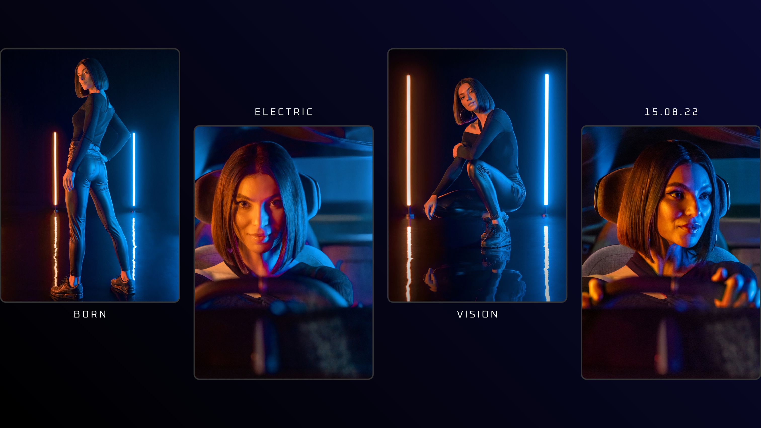
Mahindra BE required a different kind of shift altogether. This was not an established category player repositioning itself. It was the launch of a new electric vehicle brand within one of the most tradition-bound industries in the world.
From the outset, the ambition was clear. “BE was a challenger brand,” Paul says. “Youthful. Bold. About expression and individuality.”
The proposition captured that spirit succinctly: Be who you want to be. Which immediately placed the brand outside the familiar language of automotive advertising.
The category has long followed a fairly predictable set of codes. Male protagonists. Performance-focused messaging. Visual systems built around engineering prowess and driving capability. With Mahindra BE, we deliberately stepped away from that pattern.
A female protagonist became central to the storytelling. Not as a token gesture, but as a signal of a different perspective. A brand shaped by individuality rather than convention.

The inspiration points also came from outside automotive. Consumer technology. Youth culture. Contemporary fashion. The kinds of brands people associate with identity and expression.
“We looked at the world of consumer tech,” Paul explains. “Brands like Apple and Samsung. The way they present products people aspire to own.”
The goal was to build desirability. Because an electric vehicle is not just a piece of transport technology. For many buyers, it represents a shift in identity. A step into a different relationship with energy, mobility and technology.
That thinking influenced the visual language too. Electricity became a core aesthetic signal. Neon lighting. Illuminated colour. A sense of energy running through the entire system. “We wanted it to feel electrified,” Paul says. “Visually, unmistakably.”
Even the cultural references stretched beyond automotive, into iconic cinematic worlds with a futuristic aesthetic. Blade Runner. Tron. Sci-fi environments where technology and identity blend together.
The result positioned BE less like a traditional car brand and more like a cultural object. Something closer to the way people buy a high-tech device. A product. A statement. A signal of belonging to the future rather than the past. And that is often the move electric mobility requires.
When the technology signals a new era, the brand needs to look like it belongs there.
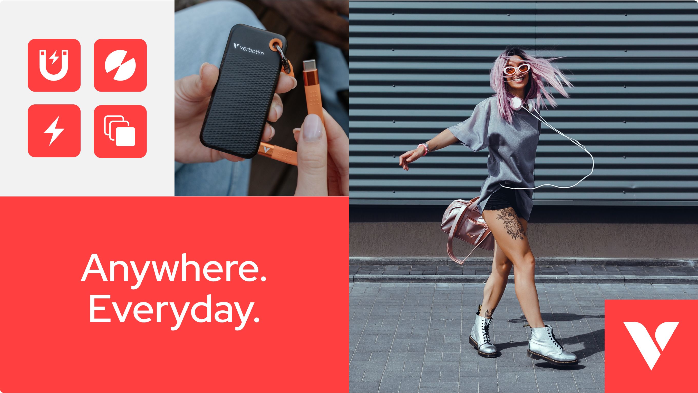
Verbatim. From legacy tech name to lifestyle-led essential.
Business-critical challenge: Modernising a legacy brand.
Verbatim presented a different challenge again – one I explored in my previous conversation with Paul.
Unlike Mahindra BE, this was a brand with decades of heritage. A name associated with optical media, data storage and the early days of personal computing. But technology had moved on. The shift from physical storage to cloud services meant the category that built Verbatim’s reputation was steadily fading.
The company responded by moving into accessories and consumer electronics. A strategic pivot that opened the door to an entirely new audience. One that, in many cases, had no memory of the brand’s earlier role in the digital ecosystem.
“They were in a bit of a dilemma,” Paul says. “A legacy brand in a category that was disappearing.”
The repositioning therefore had two jobs.
First, to introduce Verbatim to a younger generation of consumers. Second, to give the brand a role that felt relevant to their everyday lives.
The proposition Anywhere. Everyday. captured that shift. Technology that moves with you. Power banks, accessories and devices designed for a mobile, connected lifestyle.
To express that idea, the Dusted team again looked beyond the immediate category. Lifestyle brands. Travel platforms. Contemporary consumer tech. Even digital banking brands with a distinctly modern sensibility. We analysed them to understand how modern brands build emotional connection.
“You see it in brands that tell lifestyle stories,” Paul tells me. “People moving, travelling, living their lives.” That influence appeared in the photography and storytelling. Technology integrated into everyday moments rather than isolated as a piece of hardware.

At the same time, the brand system needed stronger visual cohesion. One move was to own a distinctive colour. A coral tone that could unify communications across packaging, digital and retail environments.
Another was to introduce a clearer symbolic identifier. The V “Vision mark,” as Paul describes it, created a shorthand asset the brand could deploy across products and platforms. A simple yet powerful shift. Because many of the world’s most recognisable brands rely on symbolic identifiers rather than purely typographic marks. Think of the swoosh, the apple, the Android icon.
For Verbatim, that symbol helped transform a legacy storage brand into something cleaner, more flexible and more recognisable for a new generation.
The broader lesson holds true across industries. When a legacy brand enters a new space, relevance does not come from polishing the past. It comes from building meaning around the role the brand plays in people’s lives today.
Four lessons from brands that broke the mould
Across these projects, different sectors and different audiences produced a similar set of patterns. Not a formula, but a set of conditions that make genuine transformation possible.
1. Focus on the why, not the what.
The what keeps brands trapped in feature parity.
The why opens the door to emotional territory. It creates room to build meaning and differentiation beyond technical capability.
2. Study the worlds your audience values.
dormakaba’s audience lived in design-led environments.
Mahindra BE’s audience responded to culture, technology and personal expression.
Verbatim’s new audience moved through a lifestyle defined by mobility and everyday connectivity.
The brands needed to reflect these respective worlds, not the narrow visual language of their categories.
3. Be single-minded.
Strong brands commit.
As Paul puts it:
If you have a really good core idea and a good visual articulation, and it’s single-minded, it will stand out.
Trying to hedge between multiple directions almost always dilutes impact.
4. Ambitious clients make ambitious work possible.
Perhaps the most important pattern of all.
Transformation rarely happens through agency craft alone. It requires clients willing to move. Willing to believe in the strategic idea and see it through. “You need ambitious clients,” Paul says. “Visionary clients. Brave clients.”
When that alignment happens, strategy, creative thinking and delivery move in the same direction. And the work becomes stronger as a result.
Why this matters.
With the Transform Awards Europe approaching again, it is easy to focus on recognition itself.
But awards are not the objective.
Our goal isn’t to win awards. Our goal is to create the best work possible for our clients. The award is the by-product.
Paul Marten, Creative Director at Dusted
That distinction matters. Because the real value of award-recognised work sits with the client. It validates the ambition behind the decision to reposition. And the uptick in awareness, traction, and sales gives leadership teams proof that the leap was justified. “Bad work doesn’t tend to win awards,” Paul says. “It’s the work that clears a higher bar – where good becomes genuinely great – that stands out.”
For brand and marketing leaders, that validation, combined with real KPI data, can carry weight inside the organisation. It helps demonstrate that the strategy worked. That the investment delivered something meaningful. And it reinforces the role brand can play in shaping business momentum and achieving long-term results.
Which brings us back to the categories that rarely move.
In those environments, transformation requires more than polish. More than a new logo or visual refresh.
It demands perspective. The willingness to look past category habit, understand the audience truth beneath, and build a brand world bold enough to shift perception.
When that happens, the difference is unmistakable.
Let’s get things Done & Dusted.
At Dusted, we partner with ambitious organisations to make brands Distinctly Different, creating the kind of transformation that moves businesses forward. The edge that creates brand value. From strategy and storytelling to design, activation and digital experience, we work hands-on to turn bold ideas into brands that stand apart.
If your brand is ready to move beyond category convention and carve out a clearer, more distinctive position in market, let’s talk.
Contact us today. Ready when you are.